Archive | web design RSS feed for this section

Results of Site Redesign

About a week ago I merged Daily Bingo Cards and Bingo Card Creator, and embarked on a massive site redesign.  I thought I would write a bit about how this improved my numbers.  I have compared traffic to the combined total of the two sites — all other comparisons are against Bingo Card Creator itself, because I am lazy.  These are not rigorously devised statistics — they’re my quick eyeball of typical statistics for a weekday.

Visitors: 900 -> 1,200

Pages per Visit: 2.5 -> 3.5

Time per visit: 90 seconds -> 150 seconds

Trial Downloads: 100 -> 125 to 150 (hasn’t settled yet)

Confirmed Application Installs: 20-25 -> 30-40 (hasn’t settled yet)

Sales: 2 -> slightly under 1.

I’m sort of at a loss as to what is causing the sales to go down.  Its possible that is just natural fluctuation, as all of the pre-sales indicators are way the heck up.  I also might have some folks working through the trial pipeline who remember the old branding and get turned off by the new design (“This isn’t the right site!” is a very serious worry in my market). 

A graphic on how well the design focuses user attention, stolen shamelessly from my page on St. Patrick’s Day bingo and courtesy of CrazyEgg (I just upgraded to their $19/month plan because I’m getting too much traffic for the $9 plan to be useful — please, God, send me more problems like that one).  (This image will almost certainly be truncated by WordPress.  Click to see the full sized version.)

St. Patrick's Day click tracking

And one more, because images are fun.  Caution: this isn’t the best test in the world, because I did some significant changes to the sidebar several times while the test was running, and when element IDs change sometimes CrazyEgg “loses” the clicks from some of the views.  (This is so that you don’t see big red splotches where page elements no longer exist, obviously, but it also means that most of the clicks on those buttons aren’t getting shown.)

CrazyEgg analytics of front page

Alright, back to my favorite Saturday activity: doing taxes!  (I got the uISV part done already.  It came out to a bit over $800 on $6,300 odd of profits.  Now I’ve just got to collect a bunch of statements documenting less than $100 in interest and then fill out a bunch of boring administrivia forms.)

Add An Image, Increase CTRs By Lots

I found a nice free icon set to spruce up my Irish bingo cards blog post, which is going to get seen by several thousand people in the next week.  I figured, hey, add a cool looking image to useful content and you’ll get much better linkable action out of it.  Plus, folks are much more likely to click it.  Doesn’t it grip you so much more than just the text alone?

Brilliant Bit of Javascript for Redirecting Downloaders

One of my uISV buddies, Ethan (king of language learning software), took me to task earlier today for spending so much time optimizing my download page when I could just eliminate it entirely and link the download direct to the download button in most cases.  I had always had these issues with that solution:

  • My users don’t necessarily know what to do with a window that pops up
  • If I do an HTTP Refresh or Javascript redirect, many browsers pop a security warning
  • I have to discriminate between Mac and PC users somehow
  • It is impossible to track that conversion for AdWords purposes, currently

Examining Ethan’s code made it really easy to avoid the first two issues:

function SetUpRedirect()
{
var destination = “http://www.bingocardcreator.com/free-trial.htm“;
setTimeout(“window.location='”+destination+”‘”,3000);
return true;
}

If you stick that in the OnClick attribute of a link pointing at your favorite executable, three seconds after clicking the link and having the download initiate, the user’s browser goes to the download page in the background.  This causes no security warning, scores them as a download conversion with the appropriate code on the page, and presents graceful fallback behavior if they don’t know what to do with the window that just popped up, since you can give them instructions.

Ahh, but what to do about the difference between Windows and Mac computers, which need different installers?  First, we make a controller method to handle it in Rails:

def free_trial_download
    if request.user_agent.downcase =~ /mac/
      send_file “public/files/BingoCardCreator.zip”, :type => “application/zip”
    else
      send_file “public/files/BingoCardCreatorInstaller.exe”, :type => “application/exe”
    end
  end

 That essentially says “If I’m positive you’re using a Mac, initiate a download of the zip file.  Otherwise, initiate a download of the exe file.”  (Obviously since 92% of my downloads are PC users I want to err on the side of caution.) 

Then, with a simple route added to routes.rb:

map.downloadFreeTrial ‘free-trial/download’, :controller => ‘static’, :action => ‘free_trial_download’

we get a simple URL which is platform agnostic and which decides, on the server side, which version of the file to give them.  You can then decorate your links to the platform-agnostic URL with the code to redirect the page to the download page in the background, with Analytics click tracking, and what have you.  Easy peasy!  One less step in the conversion funnel, and instantaneous recovery of a large portion of the 20% of folks who bounce out of the funnel at the download page.

WARNING: send_file will cause your Rails process to block while that IO transfer takes place under certain older versions of Rails (not in 2.0 in my testing).  This will cause requests coming to the same Mongrel after the download to wait until the download completes to start, which if you have a 56k modem user could potentially cause your basic site access to be delayed for minutesNot good news!

My site has two Mongrels running, very few dynamic requests, and very small executables.  If your site doesn’t have this profile, instead of using send_file, 302 redirect the browser to the appropriate file and let your web server handle the request before Rails does.

WARNING NUMBER TWO: You don’t want bots hitting that action, so its time for a good-old robots.txt exclusion of it.  Note that deploying this sitewide will cause your free trial page to lose quite a bit of the juice you’re sending to it.  However, given that that page is typically linked far and wide on the Internet and doesn’t include much interesting content on it (which would distract from the conversion to the trial!), you can probably live with that tradeoff.

Quick request: if you run an obscure browser or a Mac, kindly use my OS-agnostic link and tell me if it works for you.  (You should get a prompt to download BingoCardCreator.zip )

Significant Changes To Website

I’m now testing some of the upgrades to my website made possible by the new design: my purchasing page now has eye-level testimonials (the first of many — got to go through a year of email and put them on rotation) and some sidebarized credibility enhancing goodness.  The rails code for this is pretty simple:

<%= render :partial => ‘paging_bob_walsh’ %>

(He finally nagged me enough to put up testimonials.  OK, so perhaps he didn’t mention it to me directly, but the little Marketing Bob angel on my shoulder kept saying “Patrick, Patrick, where are your credibility markers?” until I gave in.

The second change I’m particularly proud of — it is designed with both SEO and users in mind.  Take a look at the sidebar on any of the “static” pages of the site (you know, the ones which are normally stuffed full of content but which don’t typically directly help conversions).

New and improved sidebar

As you can see, I now stealthily plug the holiday bingo cards for a period in advance of (and slightly past) the actual holiday, giving Google plenty of time to spider me and apply the front page link juice straight to that card.  I then pad out the rest of the slots with cards and categories chosen randomly.  That is iteration 1.0 of my linking architecture — I’m going to transition it to a neat little concept I call Rawlsian linking in a week or so, after I have it coded.  Suffice it to say its what linking would look like if the goal were to redistribute the wealth between pages.  The randomness is a fairly decent first approximation for now, and hopefully my users will also enjoy it, causing them to spend more time on my pages and become more likely to download the free trial.

Finally, I noticed in my logs that Google was hitting a lot of URLs with capital letters in them.  This was suprising, since my app is only supposed to generate URLs with lower-case letters.

Example:

http://www.bingocardcreator.com/bingo-cards/Economics

http://www.bingocardcreator.com/bingo-cards/economics

(Same content, different URLs — uh oh!  Note if you were to click on those now you’d see it has been fixed.)

This was also catastrophically bad news, because if two URLs share the same content, they split their link juice and invite the duplicate content penalty to chase both URLs out of the index.

I fixed it by identifying the two actions which had the issues and then, if the URL had a capital letter in it, lowercasing the URL and issuing a 301 redirect to the proper, canonical version.  There is probably a less hackish way to do this:

def show
#prevent Google from indexing uppercased and lowercased versions of same content
if (request.request_uri != request.request_uri.downcase)
headers[“Status”] = “301 Moved Permanently”
redirect_to request.request_uri.downcase
else #process as normal
end
end
end

My Experience With Outsourcing Web Design

The new version of Bingo Card Creator is up and open to the world now.  It features a massive integration with Daily Bingo Cards (no link since the site is, well, integrated) and a spiffy new design.  I’d like to talk a bit about why I did that, how I got it done, and my reflections on the process.

Why:

I really lack design skills.  Sure, I can edit HTML and modify CSS if given a template to work with, but visually I’m just totally lost.  Ask my coworkers — I can fail to match colors given a closet full of white shirts and black pants.  While the open source Sunny design by Sangent kept me going for a ridiculous amount of time, I had always been not-wowed by the brown text, and the HTML was getting far too crufy to use in a dynamic site and to modify quickly and easily.  You’d be *amazed* at the challenges in keeping the right hand sidebar in a pretty position, for example.  (My fault, obviously, not his.)

Sadly I did not keep a photo diary of the website to show you how much, or how little, it has changed over the years.  Ah well.

You’ve Got Talent, I’ve Got Money, Lets Party!

One of the main things I appreciated with the OSS web design I used was that it fit my budget (um, nothing) when I was starting with that $60 constraint back in the day.  After 1.5 years of growth, though, Bingo Card Creator throws off enough cash so that I can comfortably smooth over my weak points by hiring people with talent to fill them.  This worked so exceptionally well for me for getting bingo cards written (total cost: approaching $500 and worth every penny) that I was fairly confident on doing it for web design.  One catch: I only know one web designer, and he was a little busy this month.

Enter eLance.  It is essentially a Rentacoder-type site with a) a much, much better interface and b) a wide collection of Internet professionals probably a little more biased towards web design.  I wrote up what I wanted, mentioned my price range was sub $500 (mentally I was thinking $300 – $500 based on expected quality), and started soliciting bids.

Here’s the project description.  Note I tried to make things as easy as possible for the designer.  This was both to tell folks which types of designers I wanted bidding, and also to signal to designers “This is not a client who is going to suck your time and be terrible to work with”.

What I need done:

I am a business owner and web programmer. My artistic and design skills, however, are limited. I am planning on merging two of my websites in an education-related niche, and will be using the merge as an opportunity to improve the current graphical designs (which are based on very generic looking open source templates, and do not mesh well at all).

All I need done is the CSS, HTML, and assorted graphics files for one page to use as a template — I am capable of porting the template to the rest of the site by myself.

What I already have versus what you will build:

I have two functioning websites for you to work off of, including the page whose content you will be using to design the template. I will also provide you with a design document identifying features which I will need in the template — target resolution, number of columns, and the like. You get to take the existing content plus the design document and turn it into something pretty. I have also got a logo which you can incorporate into the site, or not — I’ll leave that one up to your discretion.

Style notes:

The overwhelming majority of my users are non-technical females in their 30s and 40s. The website needs to have a clean, inviting, and bright feel to it. I rather like the artistic direction of most Web 2.0 sites, if you need general inspiration — simplicity, curves, etc. If you’ve got a portfolio of sites like that, you’re more likely to get my business. What I do *not* need is a generic-looking template with a stock photo on it.

Technical notes:

For SEO purposes and to ease my integration job, I’m going to need the CSS externalized, the layout to be done primarily in CSS rather than in tables, and the code to look very clean.

Timeframe:

I’d like to have this done within 2 weeks, which is quite generous for the amount of work I expect this to require.

I started to get a lot of bids, most extraordinarily low from countries with low prevailing wages.  Many of their portfolios were filled with… websites of a quality which I would not aspire to?  Most of the bids were also copy&paste templates which gave absolutely no indication that they had actually read more than a sentence of my proposal.  Here is a fairly typical one, with some edits for anonymity.

We are team of professionals having expertise in developing web based application using PHP/ASP and Cold fusion and in web designing using Photoshop, Dreamweaver,Illustrator,Flash 8.0/Flex & Maya. After reading your project description, we are highly interested to do this CSS page for you.  [Note this first and most crucial paragraph tells me nothing of use, other than they understood the word CSS.]

Here are some of the reference websites designed by us recently.

[Snip of websites, none of which look remotely like anything in my niche, inviting to ladies, etc.]

We can carry on with your work for 100 USD where in we will design this page exactly as per your requirements using CSS. Kindly revert back incase you need for information from us. Thanks!! Bob

One proposal, however, stood out:

Hello and thanks for the opportunity to bid on your project. I understand your requirement for a clean, web 2.0 style professional layout and can deliver precisely the same.  I can deliver a high-impact template incorporating pleasant colors, ease of navigation and a look that would not tend to bore prospective visitors, even on multiple visits.  [Holy cow, a designer who talks about design and not tools.  Pinch me.]

I have over 9 years of experience working on CSS layouts and can assist you better as I am a woman myself.  [She read the spec!]  If you can give me the links to your current websites as well as a summary on what you expect the new design to do for you, [she knows she needs more information and is unafraid to ask before promising the moon!] I am willing to do a FREE sample design for you to consider before you may chose my bid or any other.

Feel free to see my portfolio -http://www.gursimran.com [take a look — the portfolio page itself sold me]

Thanks & Regards,
Gursimran

I was at this point 95% convinced I would choose Gursimran, based on the quality of her letter and portfolio.  However, she had offered to do a free design, so I decided to take her up on it.  After giving her my requirements spiel, this is what she came up with:

Hello again Patrick,

Please find attached [warning: huge image, new window] the mockup I did for you.

What I have tried to achieve with this design:

1) Integrate web 2.0 elements like soft gradients, visible text and bright choice of colors for ease of navigation and a clearer message.

2) A layout completely achievable with the use of pure CSS and with excellent flexibility as well as editable text everywhere for easy updates.

3) Individual header images which use text as their headings (editable via html) enhancing the message as well as giving a professional outlook.

4) Well spaced out elements to give a lot of open feel and ease of navigation.

5) Use of red and yellow from the logo balanced with gray elements to give subtle yet effective direction to the layout.

I do look forward to your comments.
Everything in this layout is built from scratch (except for the logo) – so feel free to ask for any modifications on the same. My goal has been to keep it simple but effective – do let me know if you prefer it any other way.

Thanks for your consideration,
Regards,
Gursimran

Its clean.  Its web 2.0.  Its beautiful.  It is also colored blood red, firey orange, and black.  OK, clearly we need a bit of work on the color scheme, but this makes me 100% certain that I’m going with Gursimran.  We then go through a few iterations on color — I keep saying variations on “bright” and “pastel”, and some of her options were closer than others.  Not being totally happy with any of them, I looked through her portfolio (the online equivalent of paint swatches), and said “I really like the blues you have here” (her personal blog).

Concurrently with the color scheme selection, we work on button designs.  Funny thing about icons — if you don’t know a bit of trivia about the cultural background of the audience, you just might make your Download Now button look like a stopsign:

Stopsign download buttons

So I told Gursimran that red + hand displayed palm up does not mean “You’re cordially invited to download this software” in America, and suggested some improvements to make things more inviting.  The next version was much improved:

Much improved icons

(Note: not using those on the website at the moment, but I probably will later after some tweaks to them.)

Then I got a bit of touchup work done on the line wrapping, and voila, one completed website.  I quickly mailed Gursimran back thanking her for the design, and released her payment.  A glitch on eLance’s side caused me to be refunded five minutes before releasing the payment, so I had to send it again, but other than that things went off without a hitch.

The End is Only the Beginning

I was largely satisfied with that design — not quite feeling the dark green, but otherwise it was worlds better than what I could accomplish by myself.  Feedback from my professional peers was also largely positive.  Then I started to integrate it with my sites, and found that a few points were a little brittle.  For example, if you had sidebar items which were 2+ lines long, they’d overflow the image designed to hold them.  Uh oh, not good when you need to write things like “Canadian Provinces Territories And Their Capitals Bingo Cards” (longest one on the site at present, by the way).

And I really didn’t like that green.  So I busted out Stylizer (highly recommended, and a uISV product to boot), replaced the image background with a plain HTML color, and then used their extremely intuitive color selector to find a green that I liked.  Then I noted its HTML value, opened up the old image in Paint.NET, used the magic select button to grab all of that wedge Gursimran had nicely drawn for me, and flood-filled it.  This gave me solid green, but solid green was a little much, so I played with a bit of a gradient to white until I found a look that I liked.  Then I went back to Stylizer, changed the text from black to white (which makes it look a whole lot less dark), and changed the rollover color to blue so it would be visible.

Now, what to do about the sidebar?  Well, I decided to go all text labels on the sidebar for consistency, and made them green because otherwise the navigation bar would be the only green thing on the site, and looking at it was making me feel blue.  (Bad puns like this are an English teacher’s stock in trade.)

Twelve hours of HTML editing and Rails wizardry later (30 templates to alter, gack), the site is looking better than it ever has and will now be MUCH easier for me to update in the future.  It also has some functionality improvements which I’ll talk about later.

Suggestions for outsourcing

  1. Get ready to be flooded by a bunch of low-quality, copy/paste proposals on the freelancer.  Ignore them, and focus on finding the diamonds in the dust.
  2. The more specific your proposal is, the better informed your designer will be and the more likely you’ll attract a quality designer (who, naturally, want quality clients).  Gursimran commented that I was one of the best clients she ever worked with, and she is certainly the best designer I’ve ever worked with, which is sincere praise even with a sample size of 1.
  3. English is funny sometimes.  Examples you can point to sometimes help a lot more than our limited design vocabulary, especially when you’re an engineer and your design vocabulary contains only the words “pretty” and “not pretty”.
  4. For God’s sake, look at the portfolio before accepting a bid.  You might not get designs as stunning as the portfolio, but you certainly aren’t going to get better, and about 50% of portfolios disqualify designers straightaway.

Anyhow, next time I need something done, I’m shortcircuiting this process and bringing work straight to Gursimran.  I recommend her to any uISV needing a quality design done in a visual style similar to what she usually produces.  Please don’t make her so busy that she can’t work on my sidebar buttons. 

Minor nuisances

Communication and length of time it took to get the design done (two weeks and change) were more problematic than it would have been if I had had face-to-face contact with the designer.  However, I was in no particular hurry.

Next Step

I’m getting a new logo designed to match the new look.  Expect my report of that next weekend.  There are also a million and one little tweaks to do to the new site.  If you’ve got comments, I’d love to hear them.

Standard Disclaimer:

I have never accepted payment for plugging service providers and won’t start anytime soon.  Gursimran graciously consented to be written up for this blog post.

Bingo Cards On Rails

No, despite what you might think, I haven’t decided to make Bingo Card Creator into a web application.

I was thinking about the full length of my conversion funnel today — from the very second someone gets on my webpage, to the instant they’ve clicked the “Send Patrick money!” button at Paypal or Google.  I was thinking “Is there any step in this process which could be easier or more streamlined?”  And of course there was — there always is.

The most prominent feature of my home page is a screenshot of Bingo Card Creator, which is dead center and dominates the page.  I know that screenshot captures viewers’ attention instantly, because a) when I made the icons prettier on it I started selling a lot more and b) CrazyEgg tells me that something like a quarter of the people who so much as glance at the page click on it.  When they click on it, the screenshot expands in a Lightbox effect. 

What I would like to happen: The visitor should, at this point, say “Wow, that is cool.  I want to try that.”  Then they click on the Free Trial button on the right, download the free trial, install the free trial, play around for a little while, click on Purchase Now, and come pay me money. 

What really happens:  Exactly that, some of the time.

What else happens:  The visitor, not too computer-savvy and left without direction, just closes the browser, hits the back button, or ambles on to read more from my website.  Not that I mind reading, you understand, but I want to encourage folks who are ready to do more than read to skip the reading and proceed straight to the trial.

So, I hit upon an idea — put the whole process on rails (in the non-Ruby sense of the word).  I know what I want the customers to do, so why not tell them?  Plus, the screenshot as it is is busy — it isn’t exactly clear what message I’m sending, other than “This program exists, and look, it has pretty buttons”.  (Do not discount the effect of pretty buttons!  Doubled my sales!)  In particular, the bottom of the screenshot (where I put advise for new users) is offputting: its a wall of text and, as we all know, nobody reads on the Internet.

So here’s what I changed about the screenshot (only after clicking to view the screenshot, mind you).  (WordPress may cut these off — click for full-sized.)

Original

became

New Version With Instructions

You’ll note the second version gets rid of the ugly Wall-O’-Text and replaces it with a nice, hopefully readable instruction on what the person probably wants to do. I used the blue for the Download Free Trial text to mentally prepare them that the Download Free Trial button is blue, without having to say so (I tried, but it started to feel cramped).

So let’s test it:

1)  Create the two images.  D’uh.

2)  Create two versions of index.htm, one telling Lightbox to use image #1 and one telling it to use image #2. 

3)  Upload them both (second one is index-alternate.htm), check for errors.

4)  IMPORTANT: Ban index-alternate.htm in robots.txt to prevent Google from smacking me with the Duplicate Content penalty.

5)  Go to Website Optimizer, get Javascript, insert, upload again.

6)  Identify conversion page.  Ideally, I would like a conversion to be actually downloading the trial.  Unfortunately, the trial download links go to an .exe and a .zip, and so I can’t exactly insert the conversion Javascript in them (for reasons beyond my ken, Website Optimizer won’t let you piggyback on Analytics’ use of a Javascript call to record clicks on non-html pages).  So, I punted and instead inserted it into the Free Trial page, because everyone downloading a trial needs to visit there and if I get 10% increase in the number of visitors there that is a good thing even if they don’t all necessarily grab the trial.

7)  Blast 5,000 4,200 visitors a week past my home page and see which one wins out.  (Edit: my original traffic estimate for September was off, so I updated it.)

8)  Do it again, and again, and again.

Deceptive AdSense Ads Worse Than Click Fraud

Much has been written about the dangers posed by click fraud on the Google advertising products, and how Google has taken steps to address the problem.  Click fraud, however, is only one of the ways for webmasters to defraud advertisers of money.  I will detail another way in this post.  The technique is already widely known among webmasters who use AdSense (and, indeed, sometimes I wonder if Google doesn’t encourage it).  If you’re spending money on the Content Network, you also need to understand it so that you can cut your losses when appropriate.

A bit of back story: recently, I bumped by spending on the Content Network up by 30%, to the “several hundred dollars a month” range.  As you might imagine, at 9 cents a click (bingo cards aren’t the world’s most competitive niche) this means I was getting a virtual torrent of traffic.  During my daily check of the summary statistics (a habit I suggest you get into after major changes to AdWords — in normal operation once a week is fine), I noticed that my click-through rate (CTR) on the content campaign had skyrocketed from 1% to 15%.

That couldn’t possibly be natural.  Remember, an AdSense ad is, by definition, being shown to someone who is at least partially interested in something related to your product but has not expressed any interest in being sold to yet.  (Folks on Google frequently have expressed an interest with their search queries, such as buy bingo card creator, which is why CTRs are orders of magnitude higher there.)  As such, you should expect CTRs to be much lower than on AdWords ads — dropping from 8-10% for a really good AdWords ad to about .5-1% or so for AdSense on most sites.

However, site design can have a major influence on how effective a site’s ads are at getting clicked.  Google recognizes this and teaches some of the tricks to optimize the ads (which, after all, makes them money): blend the ads into your site, place the ads where they are likely to be clicked, etc.  However, they have an anti-fraud policy for sites which toe the line, because using certain techniques to get the ads clicked on results in non-interested surfers clicking them, and that costs advertisers money and drives them away from the service. 

Since web pages are made to be scanned, anything that causes your eyes to be drawn toward an ad but away from its content causes your click-through rate to soar.  One previously common tactic, which is now banned, was to line up images with the advertisements in order to suggest to visitors that the links provided explanations for the images.  This resulted in quadrupling CTRs for the ads.  Since the AdSense equation is

Revenue = (traffic) * (# of ad units) * (CTR) * (cost per click) * (percentage Google gives you)

that quadrupled revenues for participating webmasters.  I’m strongly tempted to say “unscrupulous webmasters”, because once the visitor realizes they’ve been had they’ll be on the back button without a second thought, costing the advertiser money without giving them any chance to pitch their products to an interested customer.  That is, of course, the entire point of the excercise.

So that is the old scam.  Here is the new hotness: using CSS and HTML, organize your website in the fairly typical sections-broken-by-heads style.  Then, optimize your CSS such that the section travels off the page, with the clipping at a common resolution (800×600 or 1024×768) happening in such a way as to cut off the legitimate content and thereby give your visitors the impression that the ad is the content promised in the section headings. 

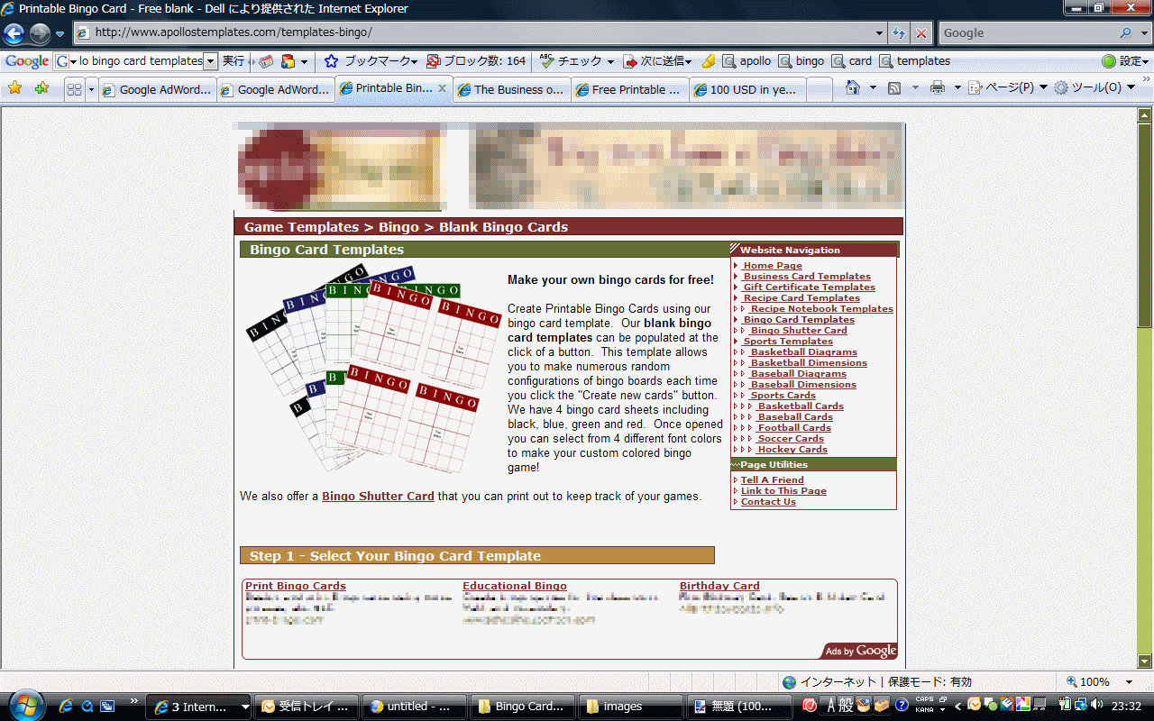
There are at least eight sites which are using this technique in the quite non-competitive bingo card niche.  I have taken a screenshot of one site which I thought was iconic.  (Editor’s note: After first posting this, the author of that site got in touch with me and said the placement was accidental.  I have no particular reason to disbelieve him, as inspection of his other pages shows a variety of ad placements.  I’m afraid that accident doesn’t explain the other sites, though.  I am keeping the pictures up to demonstrate the general tactic, but have edited the remainder of this post to be less accusatory of his site in particular.)  You really have to see it in full-screen glory to appreciate the effect.  That screenshot is about 255kb and shows the site in default IE7, but if you wanted to be really devious you can use CSS hacks to make it work equally well in all browsers at once, using pixel perfect layouts and a bit of elbow grease.  I have obscured the “branding” of the site, and have obscured the ads of my competitors to avoid associating them with it.  (If you happen to be a competitor of mine, drop me an email and I will happily give you my list of sites which are using these strategies, or you can make your own as described below.)

Here is a close up on the main content area of the page.  Again, you really should look at in in context — the actual CONTENT here is invisible until you scroll.  Unsophisticated visitors miss the distinction between the blended links and the advertisements (which happen to have quite similar titles) and click on the ads instead of the file links.  Click to see the expanded version.

AdSense Manipulation

Remember, the site does not actually show that content in the middle unless you scroll down to see it — and even with the content there, it is easy for an unsophisticated Internet user to click on the ads thinking they are getting the promised downloads. 

And click they do.  From my statistics, roughly 16% of the visitors of that page clicked on my one, single advertisement.  Given there were five advertisements, a click in my niche costs about a dime, and Google splits somewhere in the general neighborhood of 50-50 with webmasters, we can guestimate their revenue per thousand visitors using the above formula:

Revenue = 1000 * 5 * .16 * .1 * .5 = $40 CPM.  (Edit: The site owner suggests that he is earning $7.50 CPM for the site as a whole.  I don’t have access to his console, but I think my estimate is closer than his for pages which employ this technique.)

Sorting the list of the hundreds of advertisers I am paying, and ignoring ones for whom small numbers distort results, it seems like a more typical CPM for an honest advertiser in my niche is about $2.50.  So its fairly obvious why breaking the rules is so attractive — a single page with less than 1k impressions a day could generate something like $12,000 a year. 

And when I say generating, I mean “taking it from the advertisers”.

Most business owners understand the economics of advertising a product, but a brief review for the peanut gallery: I sell a $25 product, of which $24 is profit.  (It helps to be in software, the gross margins are quite healthy.)  The primary goal of having a user visit my page is to get them into the free trial of the software, which convinces about 2.5% of them to convert (i.e. buy), getting me my $24.  Thus, it is rational for me to spend anything less than $24 * .025 = 60 cents (at the margin) to achieve one trial being downloaded.

I have reason to suspect, given a year of data, that the attractiveness of my website and sales proposition should convince about 22% of interested visitors to take the trial for a spin.  Given that clicks in my niche cost about 9 to 11 cents each, this gives me an average cost of about 36-43 cents per trial download (it bounces around on a daily basis).  As 43 is less than 60, that means I am mildly profitable, with not too much room for error (if my conversion rate decreases to 2% and my cost per trial rises a few pennies I’m not making money anymore).

Bamboozling visitors to click on my ads hurts me more than errors ever could.

When an unsophisticated Internet user clicks on the “Create Bingo Cards” link thinking “This is step #1 of the 3 step process this website is pitching to me”, and then they are suddenly whisked to my very visually distinct site, they figure “Uh oh, something went wrong”.  And they immediately click the Back Button, to try to fix the mistake.  (Many of them probably click on a different ad instead, a mistake which is frustrating for them and great news for both the publisher and Google.)  As a result, it wasn’t 22% of folks coming in from these ads who actually completed a trial download, no, it was about 2%.  Which means that I was paying approximately $50 to get a sale of a $25 product — I guess I can make the loss up on volume? 

Oh, but it gets worse: Google is very, very smart about where they show your ads.  This is why they have a Content Score for the search network which prioritizes high CTR ads over low CTR ads: this maximizes money.  Google’s incentive is to maximize the number of clicks while minimizing the number of impressions,  because if they capture 100% of my budget then they want me out of the rotation ASAP so they can sell the inventory to another sucker advertiser.  This unholy, and I hope unintended, alliance of Google and the publishers using this trick sucked my budget dry within the first two hours of every day.  Google’s automated algorithms helpfully suggested I increase my spending by a factor of ten to compensate, so that instead of spending $15 a day to make $7.50 I would be spending $150 a day to make $75, for a monthly loss in the $2,000 range.

That Certainly Sucks.  What Can I Do About It?

1)  First, if you’re not in the position to routinely monitor your AdWords performance, opt out of the content network and don’t come back.  The scum sites are always one step ahead of Google, by definition, and if you’re not one step ahead of them that $2,000 a month loss could be yours.

2)  If you are in the position to routinely monitor your AdWords performance, use the Reporting feature in your AdWords console.  The report you want is Site Placement, for the previous 7 days.  Make sure you include the CTR and Cost Per Conversions columns.  Then, every day, grab your report in CSV format, and run a simple script on it to report all of the URLs where the CTR is higher than a threshold (I use 4%), the number of clicks is substantial (otherwise you’ll ban a lot of mom-and-pop sites for no good reason because 100% of their 1 visitors this month clicked your ad), and your Cost Per Conversion is greater than your profit.  (Almost guaranteed if you set your threshold right, because the only way to beat that threshold is to be exploiting your visitors, and exploited folks don’t make happy customers.)  Then, take any domain which appears on this screen, and add it to your banned list.

I am a Cygwin junkie so I do this with a gawk script every day, but if you are not a scripting wizard you can do it the longhand way, by increasing the number of rows in the visible report to 100, sorting by descending CTR (click it twice), and then visually identifying the rows that have significant number of clicks.  Then, take any domain which appears on this screen, and add it to your banned list. 

3)  If you are an engineer or product manager at Google, please, we could use some algorithmic help here.  I realize this suggestion is going to cost you money in the shortrun, but when advertisers lose money you will eventually lose money too, because they will stop advertising.  We give you all the information you need to calculate our maximum desirable cost per conversion (I have my doubts that we are intelligent in doing this, because you can use that information to screw us over royally, but business is based on a foundation of trust and for the moment I’m going to trust you).  You should provide a setting (or make it default behavior!) that ads stop appearing on any site where they transparently won’t be profitable.  I would also suggest screening sustained abnormal CTRs automatically for fraud or Terms of Service violations. 

4)  If you find a website which is abusive in their ad placement, you can complain to Google.  Realistically, I think they value algorithmic solutions over manual ones so much that you have zero hope of being heard (and they have to — they got to being a gazillion dollar company by NOT having to pay a human to deal with the little shrimp with the $15 a day advertising budget).  But if it makes you feel better, here is the link.

[Note: This post has been edited, as the author of the pictured site disputes my characterization of it, and claims that the effect was accidental.  As I have no particular reason to disbelieve that, and his other pages do not appear to be exploitative, I’m giving him the benefit of the doubt and have edited this post to remove accusations directed at his site specifically.  The technique, however, is being used by multiple sites and it strains credulity to think that eight people independently accidentally developed cross-browser compliant CSS and liquid layouts to achieve this effect.]

CrazyEgg Pays For Itself Again

Many, many moons ago I mentioned that one simple conversion trick is to put the goal for the page as the first hyperlink in the main content area.  This largely works because Internet browsers will almost reflexively jump on anything that is underlined in blue.    Anyhow, I was reviewing my printable bingo cards page yesterday (that one is a real link) in CrazyEgg and realized that the first textual link was to… Adobe Acrobat.  And they were happily profiting from my largesse, with 10% of the visitors to the 2nd most trafficked page in my site going off to download Acrobat Reader.  That was a moment of forehead slapping stupidity. 

I made a quick fix to include a link in the first paragraph to the free trial, and now approximately 10% of the visitors are banging on that instead.  Lets do the math: 8,000 pageviews for that page a month, 10% now see free trial page, 80% of visitors to free trial page download, 2% of downloaders purchase… that works out to be about 13 extra sales a month, give or take.  (Assuming the one day result of 10% clicks on that link holds up, that those clickers are equally motivated, etc, etc.  That estimate is probably on the high side, but work with me here.) 

Not a bad minute’s work, and it’s a minute’s work that is made much, much easier by seeing obvious visual clues like a huge dead zone on your heat map with a bright red island over a graphic that doesn’t even link to your own site.

Using Google Website Optimizer Safely

In my recent post about Paypal’s new icons I mentioned that I was going to use CrazyEgg to check whether the icons were more loved or not than the old ones, and I am, but I decided to go the extra mile and use Google’s Website Optimizer to do a split test.  A split test is when you randomly send half of all prospects to one version of a page and half to another to determine, in a rigorously scientific and statistical manner, which of two alternatives is better.  They’re typically a pain in the hindquarters to accomplish, but this one wasn’t so bad, thanks mainly to a new feature that Website Optimizer includes.

Previously, you had to markup the bejeezus out of your web pages to Optimize them, which harms some user experience (if the bracketed portion of the page loaded slowly, congrats, you lose) and took far too long.  Now, while thats still an option for multivariate tests, Google has a simpler option — make two pages, put two bits of Javascript in the first (front and end of the file) and one in the second, and then put a tracking code on your conversion page, and Google takes care of the rest via transparently redirecting folks who hit the first page into the second with 50% probability.

They recommend that you leave the second page up indefinitely, because folks could conceivably link or bookmark it.  I first thought that was good advice.  Then I realized DANGER WILL ROBINSON having two pages on your site with 95% similar HTML is an excellent way to get smacked down by the duplicate content penalty, and that would hurt me oh-so-much more than getting a modest bump in conversions from rigorous testing.

Happily, there was a simple one line fix to my robots.txt file that I could make to ward off any possibility of that:

#Somewhere above here we have the “User-agent: *” or “User-agent: Googlebot” line
Disallow: /name-of-my-file.htm

After I’m done with the test, I’m going to use .htaccess to 302 redirect the alternate page to the main page rather than leaving the alternate up forever, which will keep any links or bookmarks good without forcing me to keep an outdated page around and consistent with the rest of my site for eternity.  Why do more work?

Anyhow, if you want to see the site, take a gander at my purchasing page which has a fifty-fifty shot of actually showing you the old purchasing page.

A Few Followups

Increase Your Software Sales proved to be fairly popular. I hope that it covered the basics of “Phase Two” of the uISV development process well enough to give struggling beginners some ideas. In particular, take note of what I said about SEO and blogging. In that article I predicted I would be on the front page of Google for the string “increase software sales” within a week. It actually took about 48 hours and I’m number two. That is a fairly competitive (30 million results) search which has obvious economic possibilities for at least some people (payment processors, etc). Your niche also has competitive search words which a decently popular blog article could crack fairly quickly. (Why so high so fast on Google? WordPress makes the URL and title tag reflect the keywords, which were repeated in the body text. I also got linked by two high pagerank WordPress pages which automatically collect the highest traffic blogs and posts of the day. Luckily WordPress has recently changed their site design so that those posts are now static. The traffic which got me onto those was about fifty-fifty from a link I placed on joel.reddit.com and from other sources.) I anticipate the post will probably fall to somewhere lower on the front page as it ages.

I redesigned the icons on my website again after I was informed they violated Microsoft’s and Apple’s guidelines for trademark usage. Its my personal opinion that their guidelines are poorly considered and substantially broader than the rights the law actually gives them, but I’m following them as a professional courtesy. You can see the new icons on Bingo Card Creator‘s purchasing page. It wasn’t a total loss — the new buttons seem to be a little less busy than before.

e-junkie‘s Fat-Free Cart is currently incompatible with CrazyEgg on Firefox, which is unfortunate. CrazyEgg’s script causes all the links on the page to lock up if you dismiss the cart. As the incompatibility was potentially costing me money I disabled CrazyEgg and sent them an email. They got me a response within 48 hours and are looking into it, yay. Separately, e-junkie has applied a fix for the usability issue I noted earlier.

A personal note: I had a job interview yesterday with a smallish Japanese software company (250 employees) and it went extraordinarily well (the 3 decisionmakers called my boss to chitchat about me immediately after the interview was over, and the call included the line “He’ll be a great fit here”). Not only did I have a strong base in the skills their current divisions need (primarily Java, experience in both Windows/Unix environments, and being bilingual), they also have dreams of Web 2.0ifying a few of their properties and were extraordinarily pleased to hear that my “extracurricular interests” had me learning Javascript, Rails, and MVC frameworks. I will hear the results and if applicable get a written offer on Tuesday. It is easily the most attractive of my current day job employment options for August, which has taken a load off my mind. The last interview, which I thought had gone well, ended up in “You’re a very good candidate but we don’t have a position for you. Best of luck”. I have a half-dozen other applications wending their way through various employment bureaucracies.