Archive | ab-testing RSS feed for this section

Conversion Optimization in Practice: Baconbiz 2013 Presentation

I’m preparing for the BaconBiz conference as we speak.

Brief plug: BaconBiz is one of my two favorite conferences for small software/etc companies (roughly similar to mine), the other being Microconf.  You’re too late to get a ticket for 2014, since they’re sold out, but I’d highly advise coming to it if you have the opportunity in the future, if this sort of stuff interests you. You can sign up to get a reminder email about it for next year.

My talk at BaconBiz 2013 was all about conversion optimization for SaaS companies.  Most of the time when I do a talk like this I end up talking either in generalities or about one of my own products, since consulting clients very rarely let me spill all of the beans.  This time, though, Amy and Thomas of Freckle let me walk through, effectively, a mini-consulting engagement with the deliverables crammed into 30 minutes.

Amy and Thomas subsequently made changes to the Freckle marketing site partly informed by the advice in this presentation.  Ask Amy how that worked out, but suffice it to say the improvement pays for an awful lot of bacon.  My quick eyeball on their numbers is that Freckle has grown monthly recurring revenue by more than 20% since the redesign, which I would partly attribute to organic growth and partly to the redesign.  (Incidentally: I think their hybrid “standard SaaS”/long-copy page is a style which more SaaS companies should experiment with.)

Brief plug the 2nd: If you’d like to get some free advice from me about conversion optimization for SaaS companies, and also hear when my course on that topic finally ships, you can get that here.  Expect about two emails a week for the next few weeks.  (Aside: About 10k people separately get an update once or twice a month about eclectic topics about making and selling software.  If that is interesting to you, get it here.)

What You’ll Get Out Of This Talk

  • Practical advice for conversion optimization at a SaaS business.
  • Examples of front-page H1 copy to help you beat your main business adversary: the back button.
  • How to redesign a pricing page to continue the sales conversation and overcome customer objections.

As usual for talks, I’ve had it transcribed, which you can find below the video and slides.  Hat tip to CastingWords.  I just discovered you can give them a e.g. Vimeo URL and they’ll slurp the audio out of it, which saved me from doing my usual hack around not having a usable MP3 file, which was to push Play on my computer and then record the audio output.

Conversion Optimization in Practice (Video)

Conversion Optimization in Practice (Slides)

Conversion Optimization in Practice (transcript)

[music]

Amy Hoy:  Has everyone heard of “Bingo Card Creator“?

Audience:  Yes.

Amy Hoy:  OK, great.

Patrick McKenzie:  No.

[laughter]

Amy Hoy:  For the few of you who did not raise your hand and go, “Yeah,” this is Patrick McKenzie, who came from Japan to be here with us today ‑‑ and also his friend’s wedding which must not have had anything to do with it ‑‑ who started his independent software selling career with a bingo card creating tool for teachers.

Because that was such a tough market, he became an absolute wiz at SEO, automatic content marketing, all aboveboard types of stuff, and conversion optimization. Now he’s using that to help all kinds of other people also earn more money, including himself.

What was the quote that you had about your lifecycle emails that someone said how much did one email make them?

Patrick:  There are a few different quotes I could give there. One company used not my lifecycle email course, but the marketing material for the lifecycle email course, forwarded it to his director of biz dev, and the biz dev guy closed a $500,000 sale two days later.

Amy Hoy:  From the free content you gave away to promote your course?

Patrick:  From the sales pitch, yeah.

Amy Hoy:  That should give you an idea of the expertise this man presents. Give a warm welcome to Patrick McKenzie please.

[applause]

Amy Hoy:  Thank you.

Patrick:  Hideho everybody. Thanks for having me. I want to start with the question, “Why are we here?” There are a lot of ways we can interpret that question. There’s the classical theological one, but I only have 40 minutes, and I’m not going to rewrite the previous 2,000 years of western civilization in that time, so we’ll go to two smaller reasons. One, is what incredibly unlikely series of happy events happened such that I am able to come here today?

I want to give a shout out to a gentleman named Brian Plexico. Have any of you ever heard of him? Brian Plexico, back in 2006, released a skeet‑shooting score application that none of you have ever heard of. It required you to take a laptop out to a…Where do people do skeet shooting? I don’t know. It’s illegal in my country…out to the range.

You take your laptop out. You project things that look like birds, then project things that look like bullets towards the birds, and if they hit the things that look like birds, you get points. Apparently it’s difficult for people to count on one hand and shoot shotguns on the other, so they needed skeet‑shooting scoring software.

Brian Plexico released this skeet‑shooting scoring software. He sold $2000 of it, which the world did not long note or remember, but Brian Plexico wrote a blog post about this that I read in 2006.

This was the first time it pinged onto my consciousness that wow, you could actually run a software business as a side thing, not have to quit your job, not have to go to the Valley and get venture capital, and not have to be the super uber‑genius that Joel Spolsky is.  (I’d been reading his blog for a while.)

A real normal person, just like you, could do this. So why do I come all the way from Japan to BaconBiz to talk to all of you guys? Because I feel indebted to that one blog post, and also because I think that we can all help each other realize that this is an achievable thing. Amy builds me up as some sort of Internet celebrity, or genius, and I won’t lie, I am kind of intelligent but this is…

[laughter]

Amy Hoy:  Humble too.

Patrick:  Right. This is absolutely something that all of you guys can be doing. I think there’s two audiences in this talk, well, one audience, but there’s people at different stages of your business career inside of it. Some of you might not have launched your product yet. Some of you have businesses at varying levels of success and are looking for what gets you to the next level.

We’re going to start the talk with a bit of the background of my business to give you guys who think that if you haven’t launched yet, you might not think you can do this, to tell you that you absolutely can. We’ll go into the practical stuff for those of you who have businesses that you can turn around and use in your businesses tomorrow.

Most of it’s going to be specific to SaaS businesses, because that’s really where my heart and soul is, but for the info product stuff, we had that talk earlier, and we might talk later about it in that little interview thing.

Anyhow, if you want to follow on your phones that you aren’t using, it’s #baconbiz on Twitter.

Bingo Card Creator. Who knew, right? Bingo Card Creator has several hundred thousand users, largely gathered out of the United States, three million or so elementary school teachers.

I’ve gotten several thousand paying customers over the years, and it all started with a one thousand line of code Java Swing app back in 2006 that I put together in seven days of work, and a budget of $60, of which I spent $56.83.  [Patrick notes: I think it was actually $57.83.  Ack, the tyranny of arbitrarily precise approximations!]

Largest single line item on the budget was faxing a contract to eCelerate in America. The 7‑Eleven charged me $17 for that. If any of you are thinking that you don’t have enough money to start a business, you totally do, but if I was going to redo it again, I would spend a little bit more money on getting a professional web design, rather than trying to hack it together myself. That’s neither here nor there.

The reason I want to talk about Bingo Card Creator very briefly is to show that I absolutely did not start out as overwhelming Superman. You can see this is my…Is this the red button, green button? Green button does not flash onscreen. All right.

[laughter]

Patrick:  [laughs] Laser pointer view 1.0. You can see salaries in Japan are not so awesome.  [Patrick notes: The algorithm for most businesses near Nagoya for full-time engineers works out to, essentially, $100 of salary per year of age per month.  Thus, if you’re 30, you can expect a salary of roughly $36,000 a year, plus the usual white collar perk suite.  This is slightly complicated by the fact that Japanese salarymen often receive biannual bonuses of approximately 1.5 times their monthly salary, but that’s immaterial relative to the difference between Japanese pay scales and e.g. Silicon Valley (or Chicago) ones.]

The first year of Bingo Card Creator, I was planning on eventually selling as much as $200 a month. I blew through that thing in the first month, but it basically did not move the needle at all.

I just started trying things out. I learned about A/B testing. I learned about search engine optimization. I learned about AdWords. Over the years, as a part time, little five‑hour‑a‑week hobby, I had to quit World of Warcraft to run this hobby. I used to run a raid guild of 60 members or so, which is the largest enterprise I’ve ever been in charge of.

[laughter]

Patrick:  It was a whole lot more work for much worse loot, let me tell you. [Patrick notes: After approximately 3 years of 20 hours per week I think my main WoW character would have been worth about $2,000 on the open market.  Don’t go into video games for the money, kiddos.]

[laughter]

Patrick:  I just gradually grew it to the point…Some time in here, my day job transitioned from a very cushy job at a prefectural technology incubator…where I was expected to translate English for people who never needed English translations done, so I spent a lot of time reading on the Internet…to working as a Japanese salaryman, which means that the company owns you body and soul and you spend 12 to 16 hours a day, crash overnight, and then do it again the next day.

I was really not feeling it. Then about 2009‑ish, I had a big insight one day. I had spent something like 19 hours at the office. I got out of the office at 2:00 AM, ate dinner at the all night Denny’s. I checked my email, because Bingo Card Creator emails could happen at any time, on my Kindle because we didn’t have iPads back in those days.

I went to sleep for five hours, woke up the next morning and checked my email again prior to heading out to the office for another 7:30 meeting the following day. I realized that I made more while sleeping with Bingo Card Creator than I had at the 19 hour day at the office, even counting overtime.

I was, “Why am I still in this day job anymore?” I couldn’t come up with any good reason for that, so I quit.

What happened since then? In 2010 I launched a new product called Appointment Reminder. I made one big mistake about this, which I want to tell you all about.

Everybody knows Peldi, right, the gentleman behind Balsamiq Mockups? Peldi and I have been Internet buddies for a while. I knew him before he was Internet famous, and he knew me before I was Internet famous. I told him about my idea for Appointment Reminder which makes appointment‑reminding phone calls and SMS messages and emails to the clients of professional services businesses.

He said, “Is it your passion in life to optimize the scheduling of small doctors’ offices?” I said, “Oh, heck no, but it’s going to be a great business.” He’s, “Dude, stop now, stop now. Do not go forward. You will get bored, and this will be much harder than it needs to be.”

I did not listen to Peldi. I encourage you all to listen to Peldi.

[laughter]

Patrick:  Find a community. Find a problem space. Find an industry that you are really passionate about. We just discussed this in 4 minutes and 14 seconds, several years here, but if I had not been enthralled with a certain aspect of the business, that’s a lot of time.

I’ve been doing this for eight years now. If you get bored of it, then the business dies effectively. Pick something that you can really sink your teeth into. The thing I sunk my teeth into in Bingo Card Creator, I used to be a teacher. I love teaching. I love helping teachers, but it is not my passion in life.

The thing I became passionate about with Bingo Card Creator was the mechanics of optimizing the business. That’s what we’re going to be talking about a little later today. Find something you can be passionate about. I really recommend it.

Since quitting the day job…by the way, I don’t show Appointment Reminder numbers on these graphs just because I nurse “maybe I will, maybe I won’t” ideas of someday taking investment for Appointment Reminder and it’s better to keep it under your belt. That’s not English, is it? Sorry, I’m from Japan.

[laughter]

Patrick:  Anyhow, Bingo Card Creator grew while I was still at the day job. After I quit the day job, people who had heard of me on the Internet, because I had been blogging over this entire course of time, said, “Hey, all that stuff that you’ve learned about marketing software products for Bingo Card Creator seems to be pretty generalizable. Why don’t you try it with our products?”

Joel Spolsky memorably said, “Oh, Patrick’s become something of an SEO guru, learning about bingo cards. Now that he’s applying it to a product that isn’t totally bullshit, it will be pretty useful.”

[laughter]

Patrick:  Soft spoken as always, right? I did a little work for Fog Creek, and that seems to have worked out for both parties. I did consulting work for a few other well‑renowned software companies and the WildBits folks among them. Anyhow, I had a few pretty good years of it. 2012 was the best year of my life for one major reason. I got married to Ruriko McKenzie over there.

[applause]

Patrick:  This is a totally self‑indulgent slide, because that is the best I will ever look.

[laughter]

Patrick:  I always want to take a minute out of speeches like this, especially I think it will connect to this audience as bootstrappers. One of the reasons we get into this versus doing the corporate wage slave job or trying to go to Silicon Valley and roll the dice is that we want to be able to construct the life we want to be living.

Your business will be important to your life. Your career will be important to your life, but it isn’t nearly as important as the rest of your life, as your family, your friends, being involved with your community, et cetera. Definitely do keep a balance there and remember that it’s a means to the end. It isn’t the end itself.

The more boring part about 2012 was, while I took three months off of work and did nothing but answer emails once every three days or so to plot the wedding things because when you do weddings in two continents it’s kind of blech.

If you have to do that, you have to do that. But if you don’t have to do that, I strongly suggest not doing it. [laughs] I took three months off work. I stopped development, stopped answering requests for proposals. I stopped anything other than routine email support and sales exploded.

Why? There is “a season to sow and a season to reap.” The previous years I had been sowing automated systems that worked without my involvement. In 2012 they started clicking together through some efforts of my own but mostly just natural growth. We’ll talk a little about them later.

2012, pretty good. By the way, not the main focus of this point, but you can see the main ingredient in the revenue mix last year of these three products was the consulting. My current revenue for consulting in 2013 is zero dollars. I quit it recently.

Ask me why later, but at the party when I’m not on camera, because the consulting client that drove me out of consulting has a legal department which is better funded than the North Korean military and twice as vicious.

[laughter]

Patrick:  I think there are three stages for a bootstrapping business. Some of you are probably in all of them right now. There’s the stage where you don’t have a product or customers yet. You don’t really have an audience. You might not even have an idea of where you want to take it.

Then there’s the point where you’ve got a product, you’ve got some customers, but it isn’t quite hitting your financial goals yet. If a goal in your own business is to quit the day job and transition into your product full time, you might be getting, say, $2,000 a month of sales. If that’s not enough for you to live on, you want to get it to the next stage.

Then the third stage of a bootstrapping business is where it’s achieving all of your financial goals and the big question for you is, “Where do we take it from here?” My advice is largely going to be specific to the people who are in stages two or three.

If you don’t have a product yet, don’t worry anything about A/B testing. Don’t worry anything about conversion optimization. Your only two tasks are to talk to customers and produce something for them.

If you don’t have 3,000 visitors a month, I will tell you, your entire A/B testing strategy is throw out everything you ever read about A/B testing. Don’t even bother reading blog posts about it. Talk to customers. Ship stuff to them. Sell it one copy at a time until your teaching and your email lists and your publishing content have gotten you to 3,000 visitors a month of recurring traffic. Otherwise it’s just a waste of your time.

For folks like the WildBits, with large amounts of traffic or even folks who just have modest amounts of traffic, you can get a couple hundred visitors to routinely come to a blog post, then you can start thinking about your conversion optimization strategy.

I was going to talk in very hand‑wavy ways about, “You should improve your calls to action and then you can improve the colors of your buttons and whatnot.” But I’ve been at the presentation a lot before whether it’s delivered by myself or other people, and it feels boring without an actual business to focus on.

I’ve presented on my business probably about 30 times over the years, and, honestly, I’ve said almost everything I’ve ever cared to say about Bingo Cards. I thought I’d pick another business and show you what we would do with that business to optimize it for them.

Amy and Thomas were graceful enough to volunteer Freckle, so we’re going to be using Freckle as a way to dive into the meat and nitty‑gritty of optimization. What are we optimizing for? We’re optimizing for a formula which I miscopied. Sorry.

[laughter]

The Fundamental SaaS Equation

Patrick:  This is the fundamental SaaS equation. Traffic, your revenue, your profits, whatever you want, but the main driver for the business is the sum over any space you want to think of, like over all the customers, over all the marketing channels, over all the whatever.

The amount of traffic you get times your conversion rate through your funnel times…This is the bad part…your average revenue per user, which means what you charge the average person on a given period of time. I wrote one minus churn here. It’s actually one minus survivorship which equals churn. You can copy down that one if you need to.

The agony and ecstasy of running SaaS businesses is, if you can easily manipulate traffic, that excuses everything else. If you are really good at search engine optimization, you need absolutely no other skills to successfully run a SaaS business, as Bingo Card Creator might prove.

That one is really hard to explain, so we’re going to be talking more about the conversion rates and the other aspects here, a little less about churn in this presentation. Unfortunately, conversion rate, while it is easily within all of your capabilities to optimize, it takes a couple months to see the results from.

There is something that you can do to average revenue per user which tends to produce easy and obvious results, so I have to put it in every presentation. It is “Charge more.”

When I was flying from Nagoya to Philadelphia…to Detroit, there was an intermediary stop…my iPhone ran out of batteries. I told my wife, Ruriko, “My iPhone is out of batteries.” She looks over at me and she’s, “You should charge more.”

[laughter]

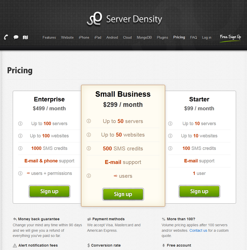
Patrick:  [laughs] Man, I’m a broken record on this one, but I’m a broken record because it works so well. This is the launch pricing for Appointment Reminder. It launched at $9, $29, $79, and an enterprise plan which was basically “Call me,” because I couldn’t actually provision that account.

I changed that later to $29, $79, $199. I got rid of the $9 plan, because, like we talked about earlier, your lowest paying customers are pathological. They have higher churn rates. They have unreasonable expectations for your product.

No lie, I had a dental office which was on the $9 plan which asked me to cut them a refund check because they hadn’t used 60 percent of their quota. So I could please send the dental office a check for $5.40.

I asked the office manager, “Has the dentist ever written a check for $5.40 to anyone for any reason if they were unsatisfied with their teeth?” She was, “No, that’s crazy.” I was, “Yes, that is, indeed, crazy.”

[laughter]

Patrick:  I no longer solicit the business of anyone who wants to pay $9. Something that I was routinely hearing when I was at the $79, $79 corresponded to 300 appointments a month. A lot of people said, “Wow, it only goes up to 300 appointments a month. It can’t possibly handle 500 appointments a month,” which is the way non‑software people think of software.

Everyone else in the room is, “That’s clearly a variable he has hard coded somewhere. He can bump it up to any number he wants less than like a million without changing anything else.” You are correct, but you think in a way that non‑software people don’t think.

Just adding the $200 option that went up to $1,000 did this to my revenue. Here’s the month before I added it. Here’s the month where I added it. Here’s the month after. This is arbitrarily scaled to $1 equals my revenue back in May of 2011.

It added basically two full increments of my revenue with just that one change. That was in a two month period where I was doing literally no other work, because it was during my wedding/honeymoon. I was not even checking my email that month.

My designer just pushed that to the page, and then, bam, revenue exploded. It even exploded because…Actually, August 2012 was the purge of August. I went through my accounts and closed the account of anybody who hadn’t actually used the system in a year because I hate taking money from people who aren’t getting value from things. It lopped off 25 percent of the accounts.

By the way, non‑use of SaaS services is a real thing. Any of you who run SaaS companies are going to have to deal with how you want to treat that. My thought was, “I’ll close the accounts and then reinstate them if anyone complains.”

Surprisingly, some people did complain. “Whoa, dude, why did you go closing my account like that?” “Because you hadn’t logged in in 16 months.” “Well, I was getting around to it.”

[laughter]

Conversion Optimization for Freckle

Patrick:  We’re going to do the 25‑minute consulting engagement for Amy and Thomas’ Freckle product. Time tracking used to focus on freelancers. These days it’s focusing more on firms.

Amy Hoy:  You could run over time.

[laughter]

Amy Hoy:  Free consulting. Keep talking.

[laughter]

Amy Hoy:  Yes, but also I’ve been his friend today. We love you. Keep talking.

[laughter]

Patrick:  The first thing we do prior to digging into what we can optimize is to get a clear sense of what the funnel is for the business. The funnel for their business is the same as the funnel for virtually every other SaaS business.

There’s some notion of getting the prospects into the free trial, “pre‑signup stuff” we often call it, getting the trialers onboarded into the product, which means getting them to the point where they have successfully used the core interaction once. For Freckle, they’ve actually logged time at least once.

Getting a trialer, they’re not just onboarded, they’re engaged with the product, where they’re actually getting value out of it in their day‑to‑day business life. For Freckle that means they have transitioned their sole source of truth for time tracking into Freckle, and then turning those trialers into customers.

Everybody knows what funnel means, right? There’s some big pool of prospects at the top and then, as each step goes on, you’ve got less and less people that survive through the funnel. Then you get some happy event at the bottom called conversion.

Each of those stages in the funnel is actually a little funnel in isolation. The pre‑signup step, where people are not in the free trial yet, there’s multiple stages that they can go. They can go to the front page, look at the plans page, and then go to the signup for the free trial page. Only if they click through that are they in the trial so there are funnels within funnels.

We’re going to be looking at those funnels within funnels in a bit of granular detail. Why do we do this analysis of what the funnels are like prior to digging in and getting started working? Because if you don’t, you can waste your time doing stupid things.

Here’s a thing which is stupid in Freckle’s instance but will work for a lot of B2B companies. I do it with almost every B2B SaaS company. There’s a point in the B2B SaaS where, after you’ve signed up for the free trial, you have to invite your team into using the product.

Typically B2B SaaS, there’s some sort of collaborative thing involved, and it gets more useful the more people you have using it. If you don’t invite your team into it, it’s highly likely that you’ll stop using it at the end of the month.

You have to be careful about the copywriting for sending out an invitation. If you have copywriting like, “You’re invited to Freckle,” that seems, from the perspective of an engineer working at the company, if they just get an invitation out of the blue saying “You’re invited to use Freckle,” they’re like, “Well, that doesn’t mean anything to me,” and just delete it.

But if you said, “Your boss, Bob, requests that you use Freckle for time tracking,” then they’re going to feel, “Oh, I sort of have a social obligation towards the guy who signs my paychecks to actually do what he tells me to on a fairly frequent basis. So I’m actually going to click the signup link and start using Freckle.”

That’s an easy, automatic win for almost every B2B SaaS company. I was about to say, “Amy and Thomas, you should get on implementing that right now.” Then I asked Thomas, “How many people who receive this email don’t actually act on it?”

That wasn’t a number we tracked anywhere, but we ran some arbitrary SQL queries, and it turns out the answer is 1.5 percent. 98.5 percent of the people who get this email actually sign into Freckle and use it so trying to optimize that number is a total waste of time. Versus we can look at other places where 30 percent of the people are going through the funnel and try to get that 30 up to 40.

Since things are multiplicatively effective, that’s like raising the revenue growth rate by 33 percent rather than trying to, “Oh, God, we’re going to work for weeks and craft the best invitation email ever and get 98.57 percent to survive through that step.” Don’t waste your time. Look at the numbers first.

Here’s the pre‑trial signup flow for Freckle. You go to the home page. It’s nice. It’s pretty. It sends you to the pricing page. You pick which plan you like. You put in your details. As soon as you hit “Go,” which is somewhere off the bottom off the screen here, you have a Freckle account.

Everybody probably has a very similar thing. This is quite standard in the SaaS industry. We’re going to dig into each of these steps and see what we can do better. When we look at the numbers, these numbers, by the way, are from KISSmetrics. I like KISSmetrics.

It’s a bit on the expensive side for bootstrappers who don’t have revenue yet. You can do it all with arbitrary SQL queries or MS Excel if you want to. But it produces nice, beautiful graphs that I can use in presentations, so I always suggest it.

Of people who visit the home page, only about 15 percent or so get to viewing the plans page. That’s a very low number relative to many other companies I’ve worked with. Improving that, as long as we get the same caliber of customer to get to the plans page, is pretty much an automatic win for Freckle.

Even if we double it, that doesn’t necessarily double sales. Just getting people to the plans page doesn’t move the needle at the business, but, in general, things that get people longer in funnel will tend to have some sort of increase later down the line, in general. There’s exceptions.

Just to give you a comparable for this, by the way, Appointment Reminder, I filed the serial numbers off, but 38 percent of the people who go to the home page actually get to the plans page. The main reason is different design things that we do. I’m going to go into what Freckle does design‑wise that I would do differently.

If they were to move their “View the plan page” conversion up to where mine is, it’s a 250 percent difference, my guesstimate from finger‑to‑the‑wind of having done this at a few companies, is that probably increases their sales growth rate by between 20 percent and 100 percent, which is, obviously, very worthwhile to do.

Amy Hoy:  Understatement. You’re a master of understatement, but that’s the most understatementy understatement…

[laughter]

Patrick:  I went into one company once and was reporting to their CEO. “I thought I was going to increase gross revenues by 100 percent. I’m sorry. I failed.” He was, “Define failure.” “I only increased gross revenue by 15 percent.” [laughs] He schooled me on the way business actually works, because that’s normally what they do in a year.

[laughter]

Patrick:  Anyhow, we’re going to look at the front page and see what we can do about the front page such that we get more people onto the plans page. We’re going to pick high value targets.

What is a high value target? It’s something that a lot of people see and they interact with and it’s likely to influence their decision on whether to go to the next page or not.

For example, what is not a high value target? There’s some wonderful copy down here, but we know nobody reads on the Internet. That’s not actually true, but statistically speaking, only 20 percent of the audience or less is going to actually read everything on this page.

If they’re making the decision after five seconds to hit the back button and not go onto the plans page, it’s probably not because they didn’t love this line “Kiss configuration goodbye” that’s down here in normal font way down on the page.

They’re probably responding, overwhelmingly, to the headline, H1 here, to this image, and to the actual mechanism for getting to the plan age. We’re going to go through those, in turn and see what we can do. At this point some people might say, “OK, we can A/B test headers against each other,” and just start. “Give me two sentences. We’ll throw them out there and see which one wins.”

I don’t love doing that, because that’s a great way to chase down a rabbit hole. Before you start throwing things at the wall, you should try to get into the head, build a mental model of the mind of your prospective customer and figure out, “I’m trying to put myself in your shoes. Why aren’t you giving us the time of day to at least see how much it costs or see what the plans are like”?

Maybe my hypothesis is that you don’t understand what Freckle is. You don’t understand Freckle is time tracking. Why might you think that? Because “Goodbye Administrivia” doesn’t necessarily tell you in the first 10 seconds you’re looking at it that it’s time tracking.

If that was the problem, if Amy was hearing that sort of feedback from customers or she was shoulder surfing people and they clicked back and she said, “Pst, pst, why?” “I don’t really know if this is for me. I don’t know what it does,” then what would we do headline‑wise to address that?

Here’s some we could test. We’d probably test them against each other using A/B testing or something. “Online time tracking with Freckle.” It’s simple. It’s to the point. It’s very obvious what it does then.

You’ll find that “simple, to the point, and obvious” beats the heck out of more florid copy.

Goodbye administrivia sounds like something that a director of marketing might really love. The director of marketing gets ROFLstomped by 17 year olds with a decent senses of the English language a lot in my experience.

Also you note that one has pretty nice SEO benefits. If you have online time tracking in the H1, you’re much more likely to rank for online time tracking. That might or might not be effective for your business. It probably wouldn’t move the needle at Freckle, to be honest.

Their primary customer acquisition strategy is people who come into the Amy/Thomas ecosystem and then, at some point, they look for Freckle by name because they’ve heard such great things about it. Another thing you could offer, frictionless time tracking, which both says what it does, time tracking, and gives them something to catch their attention with.

If I say that it’s frictionless or any other very descriptive adjective that gets your mind thinking, you start to think of all the painful things that you have done in time tracking in the past, how it’s a waste of your time, boring drudge work.

You might be intrigued enough to think, “Frictionless, why is it frictionless,” and then actually read the rest of the page where they tell you. Here’s another thing, “Time tracking with 42 percent less suck.”

Apparently in all of the classical marketing texts that are taught at colleges, they tell you to beat the heck out of any sort of personality that you put in your advertising copy. Unfortunately, [laughs] that doesn’t work very well.

I ran a World of Warcraft guild for a couple of years. I’m a geek. I own it. I often talk like a semi‑immature geek when I write copy, because it generally tends to connect with my audience.

Find out what works for your audience, whether it’s informal diction or the more classical stylings of a Harvard‑educated professional or whatever works for you. Try to get that feeling for the company, the vibe, your voice, off early and often in the copy.

By the way, if I just told you this product is more effective than the time tracking you’re using right now, your perception of how credible that claim is is probably less than if I told you, “It’s 42 percent less suck,” because numbers, for some reason, are trusted more than claims that don’t have numbers about them.

If you think about this for five seconds you might think, “Wait, wait, there’s no objective measurement for how many units of suck a time tracking tool might have.”

[laughter]

Patrick:  You can even play with that in your copy like asterisk, a “according to our Mom”, whatever. If you surveyed people with the before and after, their perceived trust would go up with the “suck” headline. That’s a thing you should always keep in mind about numbers.

Another thing about numbers, for some reason, numbers that are not round, not 10 percents or 5 percents or 25 percents, but like 43 percent are perceived as more credible than numbers that are rounded.

It’s like, “Oh, if you know how to understand a rounding function on your calculator, you must be an evil, educated scientist trying to trick me. But if you just pick a number out of thin air and end it with a seven, then clearly you’re on my side.” I don’t know why that works, but all the marketers will tell you that it works.

Don’t make up numbers out of thin air if they’re going to be consequential numbers, but if you do have a number that you can say, “People who use our tool spend 47 percent less man‑hours on this task,” don’t round that to 50. It’s against your interests, even though 50 percent sounds like more in isolation.

What else could be going wrong with the headline? Maybe the problem isn’t the customer doesn’t know what Freckle is. They just don’t understand what Freckle does for them. “Time tracking, I get it. I do time tracking. I don’t know if I spend the next week of my life learning how to use your tool, how doing time tracking with Freckle makes my business better than it is right now.”

If that’s our hypothesis, what do we tell the customer? Early, at the very tip of our relationship with them in the H1, that they should be giving Freckle the time of day. One option.

Bill more hours in less time. There are always two benefits that you can sell to any business you’re selling to, and, by the way, sell to businesses, not to, say, teachers because teachers have no money and have very unreasonable expectations. Businesses have lots of money and very reasonable expectations.

Businesses have one reasonable expectation in particular. It’s anything that increases their revenue or reduces their cost, they’re happy to pay money for. If you can credibly promise that you are going to increase their revenue or reduce their cost, the sale is almost already made.

If you are, say, a consultancy and you have to do time tracking because you bill your clients on an hourly basis, bill more hours with less time.

That’s a direct correlation to revenue for the consultancy. That’s a win for them. You have a direct correlation to revenue to reduced costs in your business. Put that front and center.

Earn more money freelancing with less pain. Again, we’re targeting the money thing. We’re getting people to select here. This, actually, is a selection that’s a bit against their interests because they’re trying to move from freelances to multi‑member firms who can afford to pay more, but just throwing this out there as an idea.

“You earn more money as a freelancer…”  If you are a freelancer, this sort of phrasing lights up your snyapses with: “Oh, I’m a freelancer. The rest of this might be relevant to me. I’ll actually read the copy.”

“Less painful?” Honestly, that’s a little overused these days.

A lot of people say their software “It’s less painful and easy to use.” It’s been overused to the point of death now that we’re no longer all using MS Office and every SaaS company says, “We are easier to use than MS Excel.”

The smallest little clap, guys.

It’s a benefit that you could potentially offer to them.

Here’s something. One of the things I love about SaaS businesses is after you’ve run it for a little while you have more data on your users than the Orwellian Minitrue. You can use that data to help out your own businesses. For example, in my business I had to increase people’s no‑show rate. I have a very good idea of how much I need to increase their no‑show rate by.

Without telling any sort of lie whatsoever, you can credibly claim something in your H1 saying, “Bill 15 more hours next month.” Again, it’s a number, it sounds like a credible claim to the reader. If it sounds like an incredible claim, you can justify it in the first paragraph.

“Our customers tell us they bill 15 more hours the month after they start using Freckle, because they rescue time.” How do they rescue time, because right now you’re not charging all of the time you actually work and move into your sales copy. We’ll go into more thoughts along that line later.

“I understand what Freckle is. I understand why someone might want to use Freckle, but I don’t know why I, in particular, would want to use Freckle. How does this connect to me?” Ramit Sethi has an awesome quote. He says, “We’re living in a world of infinite choices right now.” In a world of infinite choices, if something isn’t made exactly for me, then I’m gone.

In a world of infinite choices with 42 different time‑tracking tools you could try, why would Freckle be the best time‑tracking tool for me specifically. How do you connect to them on a very visceral, emotional level early?

Headline like “Too much free in your freelancing,” Then you can use a subhead like, “Freckle helps you actually bill every hour you actually work.”

You know there are freelancers in the audience who think, “Oh man, there was that 42 minute conversation that I had with Dave last week, but it never made it onto the sheet. If it never makes it onto the sheet, it never makes it onto the invoice, and if it never makes it onto the invoice, I don’t get paid.”

That sort of time recap happens all the time in my business. That’s noxious, and I’m losing money because of it. So we connect to them on that emotional level about this thing they’re missing.

Another option. “Freelancers and firms find Freckle fabulous.” I know alliteration is discouraged after about sixth grade or so, because everyone is, “Oh, sixth graders use that technique.”

But if you look at the data, people use this technique because it tends to draw attention really well. If you want, you can put a lampshade on it. For example, as a subhead: “Time tracking doesn’t start with an F? Dang, we had something good going there.”

Carry on with the jokey, kind of semi‑informal copy with the rest of your marketing materials or sales copy. We’re not exactly proposing marriage with the headline. We’re just trying to get them to not click the back button.

I think Paul Graham said that “The biggest enemy is never another startup.” It’s very rarely another company. Generally the biggest enemy of every company is the back button. Again, in a world of infinite choices, I need to make early and often the case for paying more attention to you.

Another way to get people to qualify it for themselves, “Do you bill at least $25 an hour?” Put any number you want in there. The people who do will be like, “Oh, yeah, that’s exactly for me.” The people who don’t might be a little defensive about that. “What, I’m not good enough for your thing just because my billed rate is $24 an hour?”

It will get them reading, and then you can make a ROI focused calculation on why they should start using your thing, which they actually do on the pricing page, which I think is a very good tactic.

That’s all we’re going to talk about with the H1 here, but I hope you’ve gotten some ideas that you can apply to your own businesses.

Amy and Thomas do many things very right in Freckle. The design of the front page, not one of them. Fair?

Amy Hoy: Fair.

Patrick:  If you remember back…looking at the design of the front page here…If you click this, all of the color that is not pink, you get taken to a product tour.

The product tour is actually a video. There’s some very catchy music. I encourage you to all watch the video. The catchy music is catchy, and it shows off the various features of Freckle. But it doesn’t really make a case for buying Freckle. The video is like, [sings] “Da, da, catchy music stops,” and this is the screen it stops on.

We’re smiling at Amy’s wonderful mug, and we don’t know how to go forward in our relationship with Freckle at all.

I went to Thomas and I’m like, “Was there an encoding problem? Where’s the rest of the video?” My expectation is that videos stop with a call to action or they stop with some notion of what I should do next, and it just didn’t.

My guess is that a lot of people are clicking on that very visually engaging element on the front. They go to the tour. They play the video or they don’t play the video because they can’t play the video at work or whatever, and then, boom, that’s the end of the relationship. They hit the back button, and they’re gone.

We wouldn’t do it that way. You should generally avoid poking holes in the funnel. Give people…Always give them a clear next step that you want them to take in the relationship. On the front page, the clear next step is ideally you would send them directly to a plans page, but if you want to send them to the tour, make sure the tour transitions directly into a signup afterwards.

If they’re not ready for the signup, transition them to an email newsletter. Get them within your ecosystem such that you can get in touch with them rather than losing them to the demon back button. The convergent element on the front page is this big pink arrow.

The first three times I looked at this page I thought there was actually no button to go to plans and pricing, because the arrow looked like a visual kind of filigree rather than anything I could actually click on. Many things about this arrow are wrong, the placement of it, the color of it, the shape of it, and probably the call to action, “See plans and pricing.”

Nobody woke up this morning and was, “Do you know what I want to do today? I’m going to work, and I’m going to see plans and pricing.”

[laughter]

Patrick:  Let’s talk about how we can make that button a little better. First, buttons should look like buttons. When I was doing this slide, I looked at my buttons and was like, “Oh, my buttons are terrible, but at least they look like buttons.”

This is a test you can do with any website you ever make. Put on a blur filter in Photoshop or whatever you use. I use Paint.net. See if you can still find the buttons on it, what’s clickable. You can find them here. It must be these rectangular looking things.

We’re socialized to think that rectangular things that have high‑color contrast with surrounding regions must be buttons and must be clickable.

Be nice to your users, too. Some users who might not be quite so familiar with the Internet might not know that that is a thing yet. They might click on things like, “Oh, pretty lady. Click on pretty lady.”

[laughter]

Patrick:  We can infer something about their state of mind from, “Click on pretty lady.” They didn’t click on pretty lady because they love hearing the mouse‑click sound. They wanted more information about how they can be like the pretty lady who is succeeding with Appointment Reminder. I just dropped them to the plans page anyhow.

[laughter]

Patrick:  No lie, that actually works. [laughs] If you put on the motion‑blur test, can you find the button on this page? My first thought for the button would be this big blue thing. You might click on the big blue thing and then get taken into the tour which does not advance your relationship with Freckle, the product. You totally missed the pink bar.

Make your buttons big and easy to click.

[laughter]

Patrick:  Somebody with a limited familiarity with the English language told me in 2007 “Patrick always goes for the big orange pancake buttons.” I love that, because I always do go for the big orange pancake buttons, because they work so well.

[Patrick notes: Example of Big Orange Pancake Buttons:

]

Generally a big button looks like a button, nice and easy to click, and good on the copywriting. Let’s talk about button copywriting.

There’s a formula for buttons. It works for almost everybody. I encourage you to use it any time you’ve got an action. Ready? It is verb plus benefit plus, if you’ve got the space for it, some mention of immediacy.

I’ll show you examples of that. “Get started now.” Classics are classics for a reason. A lot of people use things like, “Create account” or “Sign up now” or whatnot for the button. “Get started now” promises value rather than pain. They’re going to get started on whatever they’ve learned from the rest of your website is presumably a valuable activity for them.

If you focus on the account or the signup, you’re focusing on the fact that, “Yeah, charge your money now. Give us money now or get into this bureaucratic relationship that you don’t perceive as value‑added yet.” Ignore that part of the offering and focus on what they’re getting out of it rather than what you’re getting out of it.

“Start tracking your time now.” That’s very benefits focused.

“If you’re not tracking your time, start.” This only really works if they know they have a problem with it. Do what’s appropriate for your audience and, again, test the heck out of this.

“Try Freckle for free.” Free is kind of a magic word in marketing. It works very well on button copy. If you have a free trial, don’t hide the fact that you have a free trial. That sounds obvious, but a lot of people do it. I occasionally got emails for years saying, “Hey, can I try that for free”? That’s what the big “Try now” button is on the home page. “It didn’t say ‘free.'” I’m like, “It’s been free for the…”

You aren’t telepathic. That is not how things work. Make it very clear to your customers when you have a free trial or something, that is indeed the offer. Start tracking your time. There’s no reason that, just because you have to have a nice snappy copy for the button, that you can’t have some sort of elaboration nearby it.

That sort of elaboration is called microcopy. 37Signals often doesn’t mean a hand drawn front where they put the little arrow and say, “It takes only 60 seconds” or something. You can do it however you like. Since I have no graphical skills and my handwriting looks like chicken‑scratch, I usually just put it directly under the button in a small restrained font.

The microcopy for this button might be, “No, really, if you use Freckle you will actually track your time. 45 percent of our customers tell us that Freckle was the first thing that actually got them to start using it.” Maybe give them a little bit of elaboration if they want to do it. People will say, “Oh, credible claim. I will click this button to see the next page.”

Let’s talk about the plans and pricing page. I know we all have one of these. I would encourage you, when you’re talking about it to customers, not to call it “The Plans and Pricing Page.” Plans and pricing does not make sales.

If this page was an employee of the company, he’d be one of your most important employees. He’s the sales manager that is bringing, if you are doing a pure SMB business, 100 percent of the sales. This guy would be getting a massive commission.

Make sure when you’re designing this page you treat it like the important business‑lifting page that it is, which means important in terms of what you refer to it elsewhere on the sight, important in terms of how much time you spend optimizing it, important in terms of how much time you spend testing it.

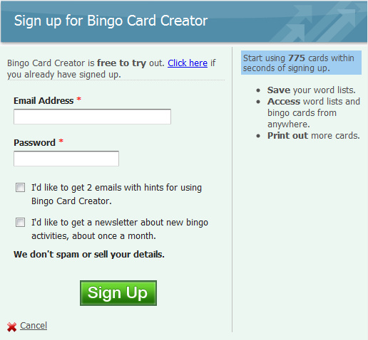
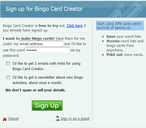
“Try Freckle for free,” totally good in terms of an H1 for it. Although, if you didn’t remember from the front page that Freckle did time tracking, you would find that information nowhere here. If you didn’t’ remember any of the sales points for Freckle from the front page, you would find none of them here. It’s totally feature‑focused. Features don’t sell software. Benefits sell software so put the benefits on this page as well.

See these little buttons? These are obviously the buttons we want people to be clicking on to sign up. Again, you don’t want to use the word “sign up,” because signup is, “Oh, bureaucratic stuff. Am I going to get charged for this right away?”

Many customers have a very interesting understanding of how the world works. All of us who have used SaaS before understand that we’re going to click the signup button and there’s going to be a page where you get a little time to think about it, type in our credit card number, and then hit “go.” As long as we don’t hit go, nothing happens.

Many of your customers don’t have that background knowledge. They think as soon as they click “Sign up,” a lawyer is going to show up at their door with an invoice that they have to pay. Ease them into that transition if they need to be eased into it by telling them, “Yes, there is value behind this button, not immediate pain with a lawyer hounding you down for collection calls.”

Here’s a good all‑purpose button to use. “Start with this plan.” Starting is something they want to do right now. Also, remember the “Kill Objections” talk from earlier? I like that. Here’s one objection somebody could have. “I don’t know what plan to pick.”

Make that either. Totally remove the choice. One thing Wildbit did recently was had one plan that you start with and they’ll pick one for you later. Or, “Start with this plan.” You can get started with any of the plans, and it’s a reversible choice that has no consequences. If you decide you want a different one three days later, great, wonderful. You can explain that with copy and very, very succinctly.

Another problem with this page, analysis paralysis. There are five different signup buttons I’ve got here. As the, perhaps, user who is not as acquainted with this product as Amy, I don’t understand which one is the best choice for me. Because I do not have that SaaS background, I might think this is a consequential choice that I have to get right or my relationship with Freckle is ruined.

In lieu of picking a choice that might be wrong, I might decide to choose nothing and just go to the back button. To get somebody over that hump, what do we do? One thing we could do is present less choices. You can have all the choices available. Just show a few of them.

What I did here…This is a pre‑existing page, I just did a little bit of tweaking to it. I just show their most expensive plan, their most popular plan, which is the freelancer one that’s low and then a medium plan that covers most of their clients. If you wanted, you could put a little text thing in here. “Were those plans not right for you? We have other ones. Click here.”

The overwhelming majority of people will not actually click that, but it will give you an option. Another thing you can do is if people get in touch with you via email, “Yeah, I didn’t see one that worked for us,” just give them a link straight to the right sign‑in page. Say, “Sorry, we’re testing stuff. We’re a small company.” Nobody ever gets mad at that.

I’m leaning on this too much.

Another thing this pricing page does not so wonderfully is the right‑hand bar. Take a look at the right‑hand bar. You’re going to get five seconds. One, two, three, four, five. Can anyone tell me anything that was on the right‑hand bar?

Male Audience Member 1:  “Don’t forget every plan.”

Patrick:  Was that on the right‑hand bar?

Man 1:  Yeah.

[crosstalk]

Patrick:  OK, “Don’t forget every plan.” There was a big list of features, and none of them mattered to anybody here. You don’t recall any of them. They don’t help drive that decision, “Do I proceed to the account screen button or not?”

In general, less is more. Rather than a feature list, stomp the heck out of your most common objections.

Objection, “What if I don’t like it?” Answer, “We have a money‑back guarantee. We don’t want your money if you’re not totally thrilled with this product. We’ve never accepted a penny from someone who wasn’t satisfied.”

Objection, “Can I trust you? I’m going to be putting my data in this. It’s data that my company relies on. What happens if you are a fly‑by‑night Internet thing”? “We’re not a fly‑by‑night Internet thing. We’ve been doing this for years. We have 6,000 happy customers including the likes of ‘logo, logo, logo.'”

Objection, “Is it worth the cost?” “Yes, you’ll receive easy, obvious ROI, and if you don’t, we’ll give you your money back.” You can link in an ROI calculation which they have elsewhere on the page. Say something from your user’s experience, like “Most of our users on the medium plan charge more than 300 times what the medium plan costs,” which is probably accurate.

Objection, “Will my team use it?” No. If I’m somebody in a business and I need to bring my team onto something, it is not just a software problem you’re solving for me. There’s also a social problem of onboarding my team and getting them to change the way they currently do things and adopt this thing and if they don’t, I can’t use it.

You should say something like, “Your team will love this.” You can even pull out stats that you have from the product like, “98.5 percent of team members who start using Freckle actually start using it. Why? Because the experience is awesome. Let us tell you more.” Give them a link that most people won’t click.

The next and last page in the pre‑signup funnel is the signup screen itself. How many people have mocked this up once in Ruby on Rails or whatever their thing of choice is, and as soon as you tested the stripe integration you can actually charge the credit card? That is the last thing that you have ever done with this page.

I see hands going up timidly. You are not alone. [laughs] I was looking at this like, “I’m going to compare and contrast my page with Amy’s and show what I’m doing better.” I’m making the same bloody mistakes!

[laughter]

Female Audience Member 2:  Yay!

[laughter]

Patrick:  Again, we’ve got whiteness over here. We’re not making any sale for Freckle on this page. Continue telling them, “Here are your objections. I’m stomping all over your objections.” Anything that is on the page that does not stomp on an objection does not need to be on this page.

For example, “You will receive an email receipt each time your credit card is charged. We do not accept other forms of payment like PayPal, IPOs, or check…POs or checks.” They probably don’t accept IPOs either.

[laughter]

Patrick:  Does that need to be on this page? Is it going to make a sale for this? No. It might prevent an email once in a blue moon to the customer support team, but answering emails is cheap, so get rid of that.

“Enter password again.” Is somebody’s objection to adopting Freckle, “I think I might type in my password wrong. I’m kind of scared about that.”

No customer in the entire world thinks that, so never ask for a password confirmation. If they get it wrong, they can click the easy “Resend password” feature that you’ve all implemented.

Other than that, much of it is pretty good. That’s just the first free sign‑up funnel. We could talk in a lot of detail about other funnels, but unfortunately I can’t be here for the entire day. I would encourage you to look at one thing that Freckle does really well. It’s their first run experience, also called the onboarding process, where they’re taking a user, they’ve just signed up for the free trial.

It’s like, “OK, here’s what we do, and here’s why it matters.” Freckle does a really good job at explaining “Here’s what we do.” They walk you through, “Here’s how you can track time in it. It’s very easy. The UI is wonderful. You’ll love it. It’s very quick to use.”

They actually have you push buttons and see the results in the UI. That’s called an in‑application tour. I really recommend them, they work very well for me and my customers. Unfortunately, Freckle doesn’t tie that to the next step, which is after showing what you do, tell them explicitly in the tour while you’re guiding them why it matters to them.

This is something that, if you’ve ever taught before, you’ll realize this. When you’re in teacher‑student mode with someone, and you’re guiding them, maybe hunched over the laptop, or whatever it is, they tend to trust anything you tell them in teacher‑student mode, because that is our default method of interaction with teachers.

After you’re teaching them about the things that you certainly know, like what buttons to push on your interface, you should tell them what changes it’s going to make in their business as a result of that.

When they’re in that teacher‑student interaction with you, they are more likely to trust that representation than the exact same representation made by the exact same people, but on the marketing site. One of my consulting clients phrased it as, “People always trust engineers more than marketers and salesmen.” Who knew?

So that’s that. Take a run through that if you want to see how it works.

Many of the better‑put‑together SaaS companies…I have one these days, Fog Creek has one these days that I wrote. I think 37Signals probably has one. Take a look at it. For those of you who are doing B2B SaaS, one little micro‑tip for tours.

At the end of a tour, always ask people explicitly, we’re always giving them the next step of their relationship to us, and to B2B SaaS, the next step of your relationship, after you’ve figured out how to use the product, is almost always onboarding your team.

Explicitly ask to get their team members on there. Why? They’ll typically churn if they don’t have their data into the system, and making actual changes to the business within the first month, in many cases testing your business, because this isn’t the law of nature.

In many cases, the best way to get their data in the system is to get their other team members into the system, because often SaaS is bought by somebody in the organization, but used by other people.

Get the people who matter to the use of it into the system. Makes it much more likely that the data will come in, and then you’ll actually get that sale. If it’s just the team leader, who doesn’t actually do time tracking, sets up a Freckle account, and then he forgets to tell his team, or he doesn’t know how to tell them how to log into Freckle, because he might not be a very technical person to begin with, then they probably don’t get that sale at the end of month.

If on the other hand they’re, “Great, you got their account, copy/paste in a list of all of the email addresses of your team members, and we’ll send them invite codes right now,” then that is much more likely to get done.

We could talk about consulting clients here, they might not appreciate that. I’ll say this, a consulting client, you’ve all heard of them, implemented the copy/paste in email thing, and tied up to the end of their tour, and the change to the business from that one afternoon of coding exceeded the change to the business of entire years of their entire team working on the product.

It’s not an obvious change, but it’s an easy change for you to make. You should probably make it if you run a SaaS business. Explicitly ask to onboard the team.

Here’s my contact information. Again, I owe a deep debt of gratitude to other people who have helped me get my business to where it is.

I love talking to people. If you ever have a question about anything, and want to run the idea past me, please drop me an email.  [Patrick notes: Seriously.  My main email address is patrick at the domain you’re reading.] I can’t promise a response back to all of them, but you’ll never offend me or anything. Thanks very much.

Postscript

If the above was interesting to you, you can get a one-month free mini-course from me on conversion optimization or get my thoughts on making and selling software in your inbox approximately once every week or two.  (And yeah, I know, I know, I haven’t written anything to you guys in a month or three.  Working on it!)

I Wrote A Book On Conversion Optimization For Software Companies

Long story short: I wrote a book on conversion optimization, SEO, and related topics, for software companies.  You can buy it here (Kindle, iPad, Nook, PDF) or on Amazon (Kindle).

For the last couple of years, folks have been asking for me to write about A/B testing, conversion optimization, and whatnot in book form.  I’ve never done it, simply because the notion of spending months of work with a publisher to write a book that would (all things being equal) likely fail to earn-out a $5,000 advance seemed to be a silly thing to do just to put “published author” on my resume.  I love writing and I like teaching, don’t get me wrong, but writing as a profession always struck me as work, and not even particularly fun work.

The folks at Hyperink convinced me to give it a try, though.  They are basically trying to make Publishing 2.0 work as a business model: provide authors with design/editing/etc using a workflow which was invented by people who grew up on Google Docs rather than manual typewriters, and create books relevant to niche audiences partially by republishing existing essays and partially by supplementing them with new material.  (The upshot for the authors is that royalties are split more equitably than 93-7-but-with-accounting-practices-that-would-make-the-RIAA-proud.)

What It Includes

  • ~ 20 essays that originally appeared on my blog, covering selling software, software pricing, conversion optimization, A/B testing, SEO, and the like, mostly of interest to software companies
  • ~ 4 essays which are totally new, including one on reducing churn rates
  • a follow-up or two on how some experiments worked out after I had written them up… including never-before-seen tales of abysmal failurebecause that sometimes teaches as much as the successes

Who Should Read This

  • Solo entrepreneurs running software businesses.  (I’d suggest actually having a working product — this book doesn’t cover product development, except when it is incidental to optimizing for marketing outcomes.)
  • Marketing / engineering / product folks at SaaS companies looking to synergize get some ideas of things which engineers can build that will make meaningful differences for the business
  • Anybody who has ever thought “Rather than reading through 600 posts in chronological order, could you just distill your blog down into the best twenty posts and categorize them for me?  My time isn’t totally valueless.  And put them on my Kindle/iPad/etc so I can read them on a plane.”)
  • My family.  (“You wrote a book?  I want to read it!  What is it about?”  “Conversion optimization for software websites.”  “I’ll pass!”)

Chapter List

  • Preface
    • Preface (new essay)
  • Selling Your Stuff
    • Introduction (new essay)
    • You Should Probably Send More Email Than You Do
    • Does Your Product Logo Actually Matter?
    • Dropbox-style Two-sided Sharing Incentives
    • Two-sided Referral Incentives Revisited! (new essay)
    • Engineering Your Way To Marketing Success
    • Selling Software To People Who Don’t Buy Software
    • Increase Your Software Sales
    • The Black Arts of SaaS Pricing
  • Increasing Conversions
    • Introduction (new essay)
    • Stripe And A/B Testing Made Me A Small Fortune
    • The Most Radical A/B Test I’ve Ever Done
    • Keeping The User Moving Towards Conversion
    • Practical Conversion Tips For Selling Software
    • Minor Usability Errors In Checkout Funnel = You Lose Lots Of Money
    • 10-Minute Tweaks to Boost Your Conversion
  • All About SEO
    • Introduction (new essay)
    • SEO for Software Companies
    • Strategic SEO for Startups
    • The Big Book of Getting People to Link to You
    • Developing Linkbait For a Non-Technical Audience
    • Why You Shouldn’t Pay Any SEO You Can Afford
  • Conclusion
    • Thanks for Reading, Lets Talk Churn Rates  (new essay)

Luckily, Hyperink Was In Charge Of Design, Not Me

If you’ve followed my blog or products for a while, you’re probably aware that I have the design sense of an addlebrained squirrel who fell into the Christmas eggnog and drowned.  Luckily, Hyperink took care of the book design and typesetting, so that it looks better on your e-reader or screen than anything I would have natively produced.  Here’s a sample (click to enlarge):

Formats Available

In Which I Explicitly Ask For The Sale

If you generally enjoy my writing and think a curated collection of twenty essays on the topic of making more money for your software business is of interest to you, please buy the book.  (It is, as far as I know, $9.99 everywhere you can buy it, but vagaries of the publishing industry mean that I can’t guarantee that this is true for you.)  If you don’t want to buy it, don’t worry, I won’t think any less of you — enjoy the blog, come back for more next year.  If you buy the book and enjoy it, I’d encourage you to leave a review on Amazon, as folks are really keen on seeing them.

Note to other potential authors: the folks at Hyperink are Good People and were a pleasure to work with in the discussion and editing process.  If you’ve considered trying your hand at writing a book but, like me, thought the traditional publishing industry is largely toxic and exploitative by construction, I’d encourage you to give them a whirl.

P.S. I traditionally post a Year In Review for my businesses, covering what worked and what didn’t as well as statistics, shortly before Christmas.  See, for example, 2011’s edition.  I will do it again this year, but owing to some bookkeeping hold-ups, it will be shortly after Christmas rather than before.  May you and your families have peace, love, and health this Christmas and always.

Doubling SaaS Revenue By Changing The Pricing Model

Most technical founders abominably misprice their SaaS offerings to start out.  I’m as guilty of this as anyone, so I wrote up my observations about un-borking this as The Black Arts of SaaS pricing a few months ago.  (It went out to my mailing list — sign up and you’ll get it tomorrow.)  A few companies implemented advice in there to positive effect, and one actually let me write about it, so here we go:

Aligning Price With Customer Value

Server Density does server monitoring to a) give you peace of mind when all is well and b) alert you really darn quickly when all isn’t.  (Sidenote: If you run a software business, you absolutely need some form of server monitoring, because the application being down costs you money and trust.  I personally use Scout because of great Ruby integration options.  They woke me up today, as a matter of fact — apparently I had misconfigured a cronjob last night.)

Anyhow, Server Density previously used a pricing system much beloved by technical founders: highly configurable pricing.

Why do geeks love this sort of pricing?  Well, on the surface it appears to align price with customer success (bigger customers pay more money), it gives you the excuse to have really fun widgets on your pricing page, and it seems to offer low-cost entry options which then scale to the moon.

I hate, hate, hate this pricing scheme.  Let me try to explain the pricing in words so that you can understand why:

  • It costs $11 per server plus $2 per website.
  • Except if you have more than 10 servers it costs $8 per server plus $2 per website.
  • Except if you have more than 50 servers it costs $7 per server plus $2 per website.

This is very complicated and does not align pricing with customer success.  Why not?

Pricing Scaling Linearly When Customer Value Scales Exponentially Is A Poor Decision

Dave at Server Density explained to me that their core, sweet-spot customer has approximately 7 servers, but that the per-server pricing was chosen to be cheap to brand-new single-server customers.  They were very concerned with competing with free.

Regardless of whether this wins additional $13 accounts, it clearly under-values the service for 7 server accounts, because their mission-critical server monitoring software in charge of paging the $10,000 a month on-call sysadmin to stop thousands of dollars of losses per minute only costs $79.  You don’t get 7x the value from server monitoring if you increase your server fleet by 7x, you get (at least) 50x the value.  After you get past hobby project you quickly get into the realms of a) serious revenue being directly dependent on the website, b) serious hard costs like fully-loaded developer salaries for doing suboptimal “cobble it together ourselves from monit scripts” solutions, and c) serious career/business reputational risks if things break.

Let’s talk about those $13 accounts for a moment.  Are $13 accounts for server monitoring likely to be experienced sysadmins doing meaningful work for businesses who will solve their own problems and pay without complaint every month?  No, they’re going to be the worst possible pathological customers.  They’ll be hobbyists.  Their servers are going to break all the time.  They’re going to misconfigure Server Density and then blame it for their server breaking all the time.  They’ll complain that Server Density costs infinity percent more than OSS, because they value their own time at zero, not having to e.g. pay salaries or account for a budget or anything.

My advice to Dave was that Server Density switch to a SaaS pricing model with 3~4 tiers segmented loosely by usage, and break with the linear charging.  The advantages:

  • Trivial to buy for non-technical stakeholders: name the plans correctly and they won’t even need to count servers to do things correctly.  (“We’re an enterprise!  Of course we need the Enterprise plan!”)
  • Predictable pricing.  You know that no matter what the sysadmins do this month, you’re likely to end up paying the same amount.
  • Less decisions.  Rather than needing to do capacity planning, gather data internally, and then use a custom-built web application to determine your pricing, you can just read the grid and make a decision in 30 seconds.
  • More alignment with business goals.  Unless you own a hosting company, “number of servers owned” is not a metric your CEO cares about.  It only tends to weakly proxy revenue.  Yes, in general, a company with 10 servers tends to have more commercial success than a company with 1 server, but there are plenty of single-server companies with 8 figures of revenue.

(Speaking of custom-built web applications to determine pricing, the best product with the worse pricing strategy is Heroku.  Enormously successful, but I’m pretty sure they could do better, and have been saying so for years.  All Heroku would have to do is come up with four tiers of service, attach reasonable dynos/workers/databases to them, and make that the core offering for 90% of new accounts.  You could even keep the actual billing model entirely intact: make the plans an abstraction over sensible defaults picked for the old billing model, and have the Spreadsheet Samurai page somewhere where power users and the sales team can find it.)

Ditching Linear Scaling In Favor Of A Plan Model

After thinking on my advice, Server Density came up with this redesign:

I love this.

  • The minimum buy-in for the service is now $99 a month, which will segment away customers who are less serious about their server uptime.
  • You now only need to make one decision, rather than needing to know two numbers (which you might not have access to at many of their customers).
  • The segmentation on users immediately triples the price for serious businesses using the service, irrespective of the size of their server fleet.  This is good because serious businesses generate a lot of money no matter how many servers they have.
  • Phone support will be an absolute requirement at many companies, and immediately pushes them into the $500 a month bucket.

My minor quibbles:

  • I still think it is underpriced at the top end.  Then again I say that about everything.
  • Did you notice the real Enterprise pricing?  (Bottom right corner, titled “More than 100?”) Like many SaaS services, Server Density will quote you a custom plan if you have higher needs.  Given that these customers are extraordinarily valuable to the business both for direct sales and for social proof, I might make this one a little more prominent.

Results From Testing: 100% Increase In Revenue

Server Density implemented an A/B test of the two pricing strategies using Visual Website Optimizer.

At this point, there’s someone in the audience saying “That’s illegal!”  That person is just plain wrong.  There is no carbon in a water molecule, and price testing is not illegal.

What if the fact of the price testing were discovered?  Not really that problematic: you can always offer to switch someone to the most advantageous pricing model for them.  Since most existing customers would pay less under variable pricing than they would under the above pricing grid, simply grandfathering them in on it removes any problem from people who have an actual stake in the business.  For new customers who get the new pricing grid but really, really feel that they should be a $13 a month account, you can always say “Oh, yep, we were testing.  I’ll give you the $13 pricing if you want it.”  (David from Server Density says that this is in fact what they did, three times, and had no lasting complaints.)

Most customers will not react like this because most customers do not care about price.  (Those that do are disproportionately terrible customers.  To quote David from Server Density, “We had the occasional complaint that pricing was too high but this was from users with either just a single server or very low cost VPSs where the cost of monitoring (even at $10/m) was more than the cost of the server.”)

Anyhow, where were we?  Oh yeah, making Server Density piles of money.  They requested that I not disclose the interval the test was conducted over, to avoid anyone reasoning back to their e.g. top-line revenues, but were OK with publishing exact stats otherwise.

Variable pricing: 150 free trial signups / 2161 visitors

Pricing plans: 113 free trial signups / 2153 visitors

At this point, variable pricing is clobbering the pricing plans (they get 25% less signups and pricing plans being inferior at maximizing trials has a confidence over 99%)… but let’s wait until this cohort reaches the end of the trial period, shall we?

Server Density does not make credit card capture mandatory.  (I might suggest revising that decision as another test.)

Variable pricing: 23 credit cards added / 2161 visitors

Pricing plans: 18 credit cards added / 2153 visitors

That’s a fairly similar attachment rate for credit cards.  But collecting credit cards doesn’t actually keep the lights on — the important thing is how much you successfully charge them, and that is highly sensitive to the prices.

Variable pricing: $420 monthly revenue added / 2161 visitors   (~$0.19 a visitor)

Pricing plans: $876 monthly revenue added / 2153 visitors  (~$0.41 a visitor)

+100% revenue (and revenue-per-visitor) for that cohort.  Pretty cool.

(P.S. Mathematically inclined readers might get puzzled at the exact revenue numbers — how do you get $876 from summing $99, $299, and $499?  Long story short: Server Density is a UK company and there are conversion issues from GBP to USD and back again.  They distort the exact revenue numbers a wee bit, but it comes out in the wash statistically.)

We Doubled Revenue?!  Can We Trust That Result?

Visual Website Optimizer displays on the dashboard that it is 93% confident that there was indeed a difference between the two.  (The reported confidence intervals are $0.19 +/- 0.08 and $0.41 +/- $0.16.  How to read that?  Well, draw your bell curves and do some shading, but for a qualitative description, “Our best guess is that we doubled performance, but there’s some room for error in these approximations.  What would those errors look like?  Well, calculus happens, here we go: it is more likely that the true performance improvement is more than ~3x than it is that there was, in fact, no increase in performance.”)

Truth be told, I don’t know if I trust that confidence in improvement or not, because I don’t understand the stats behind it.  I understand the reported confidence intervals and what they purport to measure, I just don’t know of a defensible way to get the data to that point.  The ways I’m aware of for generating confidence intervals for averages/aggregates of a particular statistic (like, say, “Average monthly revenue per visitor of all visitors who would ever sign up under the pricing plan”) all have to assume something about the population distribution.  One popular assumption is “Assume normality”, but that’s known to be clearly wrong — no plausible arrangement of numbers makes X% $99, Y% 299, Z% $499 into a normal distribution.  Even in absence of a rigorous test for statistical confidence, though, there’s additional information that can’t be put in this public writeup which causes me to put this experiment in the “highly probable win” column.  (If my Stats 102 is failing me and there’s a simple test I am neglecting, feel free to send me an email or drop a mention in the comments.)

Note that since this is a SaaS business that is monthly revenue added.  Increasing your monthly revenue from a particular cohort by $450 increases your predicted revenue over the next year by in excess of $4,000.  (The calculation is dependent on your churn rate.  I’m just making a wild guess for Server Density’s, biased to be conservative and against their interests.)

Now, in the real world, SaaS customers’ value can change over time via plan upgrades and downgrades, and one would ideally collect many months of cohort analyses to see how things shook out.  Unfortunately, in the equally real world which we actually live in, sometimes we have to reason from incomplete data.  If you saw a win this dramatic in your business and were wondering whether you could “take your winnings” now by adopting the new pricing across all new accounts, I would suggest informing that decision with what you previously know about customer behavior vis-a-vis number of servers over time.  My naive guess is that once a server goes into service it gets taken out of service quite rarely indeed and, as a consequence, most Server Density accounts probably have roughly static value and the few that change overwhelmingly go up.

And what about the support load?  Well, true to expectations, it has largely been from paid experts at larger companies, rather than from hobbyists complaining that they don’t get the moon and stars for their $13 a month.  Dave was particularly impressed how many were happy to hop on a phone call to talk about requirements (which helps learn about the customer segments and develop the future development and marketing roadmaps) — meanwhile, the variable pricing customers largely a) don’t want to talk about things and b) need a password reset right now WTF is taking so long.

Server Density expects that their plan customers will be much less aggravating to deal with in the future, but it is still early days yet and they don’t have firm numbers to back up that impression.

Testing Pricing Can Really Move The Needle For Your Business

Virtually no one gets pricing right on the first try.

(When I wrote the pricing grid for Appointment Reminder I snuck a $9 plan in there, against my own better judgment, and paid for that decision for a year.  I recently nixed it and added a $199 plan instead.  Both of those decisions changes been nothing but win.)

Since you probably don’t have optimum pricing, strongly consider some sort of price testing.  If I can make one concrete recommendation, consider more radical “packaging” restructurings rather than e.g. keeping the same plan structure and playing around with the plan prices +/- $10.  (This means that, in addition to tweaking numbers, you find some sort of differentiation in features or the consolidated offering that you can use to segment a particular group of customers into a higher plan than they would otherwise be at numerically.)

For more recommendations, again, you probably want to be on my mailing list.  You’ll get an email today with a link to a 45 minute video about improving your app’s first run experience, the email about SaaS pricing tomorrow, and then an email about weekly or biweekly about topics you’ll find interesting.  Server Density is not the only company telling me that those emails have really been worth people’s time, but if they don’t appeal to your taste, feel free to unsubscribe (or drop me an email to tell me what you’d rather read) at any time.

Disclosure: Server Density is not a client, which is very convenient for me, because I’m not ordinarily at liberty to talk about doubling a client’s revenue.

Stripe And A/B Testing Made Me A Small Fortune

I’ve run software businesses for the last six years, all premised on the simple notion that if I provide value to customers they should pay me money.  The actual implementation of translating their desire to pay into money in my bank account was less simple… until I found Stripe.  They’re now up there with Twilio and Heroku in terms of “infrastructure companies which will totally change the way savvy software companies do business”, and if they ever get international processing nailed, I think they’ll probably take over the industry to Paypalian scales.

How do I love you Stripe, let me count the ways…

Well Thought Out API Design

Ever worked directly with the Paypal API?  Keith, my podcast co-host and somebody who routinely codes systems that process millions in payments, shudders when he mentions it.  The Paypal API is powerful and (fairly) reliable, but the experience of coding against it is absolutely maddening.  It is very much a legacy API which has to support decisions made at the dawn of the Internet which were largely driven by considerations not relevant to software developers or web entrepreneurs.

Stripe’s API is one of the best I’ve ever worked with:

  • It uses all the REST-y goodness that the web development community has come up with in the last few years.
  • The documentation is suitably comprehensive, organized for easy consumption, and screams “You will have this in a secondary window when you’re coding stuff that matters” rather than “This was designed as a 450 page PDF by a standards committee.”  The table of contents for any one of Paypal’s APIs is longer than all the docs for Stripe… and less useful.
  • There are several first-party libraries available, they work, and they feel like first-class citizens of their respective ecosystem.  Stripe-ruby is fantastic and feels like ruby.

Most Painless Integration Ever

As a direct consequence of having a really, really well-designed API, integration with Stripe was a breeze.  Getting credit card processing hooked into Bingo Card Creator — authorization, charging, accounting, the works — was 29 lines of code.  I signed up for Stripe, got started with the API documentation, and successfully charged a real credit card from production three hours later.  They’ve got the fastest time-to-business-value of any API since Twilio.
One major reason Stripe works exceptionally easily is because of stripe.js.  Basically, if you’ve ever tried to charge credit cards before, you’re aware that there is a PCI-DSS standard out there and if, e.g., credit card numbers ever hit your hardware then you’re in for a world of painful compliance audits and ridiculous checking-boxes-for-the-sake-of-checking-boxes.  (“No, I don’t run my server on a server which sits in an unlocked room in a building the general public has access to.  Phew, dodged a bullet there.  Now excuse me while I go install some anti-virus software on my Ubuntu box and very diligently review my Nginx logs daily.”)
There are two major ways around PCI compliance:
  • You redirect people off-site for the transaction to e.g. Paypal or Google Wallet, and let the megacorps worry about it, then they redirect people back to you when they are done.  This is a poor user experience that often confuses customers and might decrease conversion rates.
  • You have an iframe or something capture their credit card on your site but actually submit it only to the payment processor.
Stripe.js is a very well-implemented “or something”, where JavaScript that they’ll provide for you hooks into your credit card form with trivial work.  (About ~6 lines for me.)  When a user submits the form, you instruct Stripe.js to AJAX-y over to their servers and authorize the card.  Then you process the results in a callback.  This lets you verify e.g. that the card exists and is chargeable prior to submitting your form and executing your server-side purchase logic.  Stripe will then give you a token allowing you to securely charge the card for the authorized amount, and you can choose whether to do that or not on your server-side.  (For example, I perform other business logic validations first, and void the authorization if e.g. the user has already purchased the software.)
This means that their credit card details never hit your server.  Now, rationally speaking, if your server is insecure then the page the credit card form is hosted on is in the hands of the enemy, and you can no longer trust that Stripe is the only party which sees the credit cards.  However, PCI compliance has very few rational parts about it.  Stripe gets you past that hurdle with a minimum of pain.
This is really, really important for developers because you get end-to-end control of the user experience.  You don’t have to do a redirect off-site and you don’t have to have a garishly styled external iframe in the middle of your app.  You can slide a credit card form in whatever part of your workflow makes sense, have it feel organically like your app (because it is, actually, your app), avoid the Paypal/Google attempts to use your relationship with a customer to capture a new account for themselves, etc etc.  That has the potential to significantly increase revenue.  (More on that later.)

Amazing Support For Developers by Developers

So let’s say you happen to support a Ruby on Rails application coded by a novice web programmer in 2008.  Hey, it happens.  There are a lot of old gems required for the program to operate, somewhat creakily.  Let’s further suppose that this causes you to have a conflict with a dependency from an external API vendor, because the vendor doesn’t specify what version of the old gem to use with their ruby library.  If you mail support@, and tell them “When using a version of this gem four years out of date, your library dies on a particular line, because you use an API that doesn’t exist in the oldest versions of the library.  I can’t use the latest version of the library because it causes dependency conflicts.  What should I do?”, what would you expect them to say?
Here’s what I expected:  “Thanks for your email.  We can’t help you with coding your application.  You should use the latest version of the library.  Please see our FAQ at…”
Here’s what Stripe actually said:

 Hey Patrick,

Thanks for the report. I took a quick look:

$ git clone git@github.com:archiloque/rest-client
$ git bisect start
$ git bisect good v1.0.3
$ git bisect bad v1.6.1
$ git bisect run ruby -rubygems -e ‘$:.unshift “lib”; require
“stripe”; Stripe.api_key = “KEY”; begin; Stripe::Plan.all.count;
rescue; exit 0; end; exit 1′

Suggests that 7563fd as the culprit. Looking at the log, this seems to
be around 1.3.0. Then:

$ git log v1.3.1..7563fd
$ git log v1.4.0..7563fd

So, looks like v1.4.0 is the first version that included that #body
interface change.

I just pushed stripe-ruby 1.5.22, which adds a dependency on 1.4.0 of
rest-client.

Thanks again for the heads up. Let us know if you run into anything else.

I am not easily emotionally moved by git command lines, but this is clearly somebody who understands me and what I need in life.  In addition to exactly diagnosing the problem (I was on rest-client 1.0.3, the most recent version was 1.6.1, and it would really have been compatible with anything after 1.4.0), he fixed it for everyone else.

(Sidenote: This is one of the very few times in my life where mailing support@ made me a better engineer.  “You can figure out which version of a library breaks your application by running your minimal failing test suite commit-by-commit, watching for exactly the commit where it fails, and then correlating that to the released version which will actually work for you.  But since that will take forever, use binary search instead.  And there exists a git command which will do this for you.”)

That email was signed by the co-founder.  Patrick Collison, when he isn’t running a payments company, apparently found time to verse himself in arcane git commands.  I was practically vibrating with “These guys understand where I’m coming from.” after that, and they’ve not let me down since.

I’ve had exactly one serious problem with Stripe, in a year.  Their API broke for three transactions, due to a load balancer issue.  This caused their client library to return “Unspecified error, card not charged”, prompting my application to not deliver software to the user, but they were actually charged.  Clearly, that’s quite problematic.  They proactively got in touch with me about it, fixed the problem, and generally demonstrated competence and professionalism.  I gave away three free copies of the software and apologized profusely.  We haven’t had any recurrences since then, over about a thousand transactions.

Their Web Application Rocks

So in addition to programmatically charging cards, payment processors typically provide web interfaces.  They’re typically abysmal.  Paypal’s — and, again, I like Paypal — will take upwards of 15 seconds to find a transaction when you’re searching by its primary key, and it looks like it was written in 1996, principally because it was.

Stripe’s interface is pretty (don’t discount how much that matters, since you actually have to use it), snappy, responsive, and well-thought-out.  It has an awesomebox which, given 1234 as input, will quickly find every transaction with 1234 as the last four digits of the credit card, bring up the transaction for sale #1234 (an ID my code passed over with the transaction), finds all of your $1,234.00 charges sorted by recency, etc.  There has to be someone in Stripe who actually runs a side-business on it, I swear.  That or they’re telepaths.

Refunds are one click.  (And also available with an API.  This has saved me tens of minutes versus Paypal, since I have to log in, find the transaction, and write a refund note manually to do a refund with them.  It also saves me a lot of frustration, as correlating Cindy Smith to a Paypal transaction is difficult, whereas in Stripe all I have to do is keep their authorization token around server-side and then refunding a transaction is as easy as customer.sale.refund!)

Each transaction has a programmer-comprehensible set of logs attached to it, so I can quickly debug application problems.

Oh, they also have an API sandbox, with credentials segregated from the production API, and which can be manipulated via both the web interface and the API trivially.  I think this is an absolute hard requirement for APIs which can actually touch the real world.  (It is one of my very few knocks against the Twilio API.)

Stripe Has Fair, Comprehensible, Comparatively Transparent Terms

Ever heard “Paypal turned off my account waily waily” or “Paypal froze my money waily waily”?  Most complaints about Paypal actually aren’t about the API, they’re complaints motivated by a) commerce is hard because of the amount of fraud on the Internet and b) Paypal doesn’t historically do a great job of giving you resolution options if it’s fraud detection is overly aggressive in your case.  (I actually believe that they’re worlds better on this than they are perceived to be — the one time Paypal had an overly aggressive fraud alert on my account I was able to resolve it with a single one-minute telephone call.)

Stripe asks for prior review of your business model but, in my experience, approves you automatically and then actually does the human review while you actually have a set of working API keys.  They make transfers to your bank account 7 days after your customers pay you, to make an allowance for fraud/refunds/etc.  Seven days is impressively faster than most merchant accounts.

Stripe really shines in those rare cases where you need a human in the loop.  It’s still always a good idea to tell people in advance if you’re going to do something which will trip a fraud screen (e.g. open payments for a widely anticipated conference and then collect $X00,000 in $500 chunks from people in multiple countries — this will almost certainly get a Paypal account frozen).  A friend of mine — who has previously had issues with cleared payments getting filched by Google Checkout and then got Google’s customary /dev/null customer support — asked Stripe if an upcoming product launch would cause an account freeze.  “Thanks for contacting us.  Of course not.  You’re clearly legit.”  It’s like they found the sweet spot between “Computers can make decisions in lightning-speed at scale” and “Humans can actually be trusted with discretion.”

Developers Obsess About Price So I Guess I Have To Mention It

Stripe charges $0.30 + 2.9% per transaction, which is comparable with Paypal at low volumes.  This is frequently the #1 thing devs tell me they look for in their payment processor.  That is insane.  We sell products which have margins that come very close to 100%, and saving pennies on transactions to spend tens of thousands on integration costs (*) or to shave full percentages off our conversion rates is absolute madness.

* Think I’m exaggerating?  That’s about two weeks of dev time.  Trust me, you will not get a shopping cart integration done in two weeks with most payment providers.  Again, it took me three hours with Stripe.  I still can’t believe that.

I Extensively A/B Tested Stripe Against Off-Site Checkout And Found…

… that I should really not ship prototype shopping carts, even when I think it is really cool to get something out the door.

Back prior to the redesign of Bingo Card Creator, I tested Stripe on-site credit card payments (the interface for which I threw together with Twitter bootstrap in ~45 minutes) against Paypal and Google Checkout.  Specifically:

Test #1: Paypal / Google Checkout vs. Paypal / Google Checkout / Stripe

Test #2: Paypal / Google Checkout / Stripe vs. Stripe

Test #3: All three vs. all three, with the difference being whether customers upgrading directly after a trial limitation had been reached were sent to the purchasing page or an in-app credit card form

All three of these tests were null results.  (i.e. No significant difference in aggregate purchases between either of the two options.  Interesting, though, any time paying by credit cards was an option, that was overwhelmingly the customer favorite.  When the choice is Paypal versus Google Checkout, I get 50/50.  When the choice is Paypal / Google Checkout / Credit Card, I get 5-5-90 or thereabouts.  That could be sensitive to the design of my pages, I don’t know — I tested e.g. re-ordering the buttons and that didn’t change things, but didn’t go on to test e.g. button copy or color.)

[Edit: Whoopsie!  A comment on HN sent me back to my A/B testing records.  Turns out Test #2, which I had misreported as PP/GC vs. Stripe but was actually PP/GC/Stripe vs. Stripe, was actually a weak 90% significant win for PP/GC/Stripe.  Test #3 was a weak 90% significant win for sending folks to the purchasing page rather than the hacky Boostrap CC form.  Sorry for the misreporting earlier — these were in the Big Book O’ Failed Tests and I forgot to check the detailed reason for why.]

So, despite customers overwhelmingly choosing credit cards, adding that option via Stripe wasn’t capturing additional sales at the margin.  This was surprising to me, because it is received wisdom in the conversion rate optimization community that users hate off-site checkout.  I mentally tied a string around my finger to revisit the issue later.

I Followed Up On Earlier Testing And…

Earlier this year, after having decided to offer all three payment options full-time, I did an experimental website redesign, in an A/B test.  This gave me the opportunity to have my cobbled-together credit card form replaced by one done by a professional designer.  That experimental redesign was very, very wide-ranging and affected pretty much every stage of the software purchase funnel.  Results were mixed — some steps radically better, others worse — and netted out to no significant change in revenue.  Since the user experience was very improved, I adopted the redesign.

While I was looking at the stages of the purchasing funnel, I saw that the newly redesigned checkout experience didn’t really seem to motivate customers more or less than the old, ugly checkout experience, but users continue to overwhelmingly prefer credit card checkout either way.

Anyhow, some months later, I took a run at fixing the part of the funnel which had suffered most in the redesign.  For whatever reason, improvements in the usability of my application had made users much less likely to hit the free trial limitations.  This caused less of them to get taken into the purchasing pathway, after which point their experience was largely consistent across both versions of the site.

So I tested the stupidest thing that could possibly work to get more people to hit the trial limitations: decrease people’s free quota from 15 cards to 8 cards.  And I did that in an A/B test.  One line of code which tested, literally, two characters in the program.

Wham.

Not only did the 8 card limit absolutely crush the 15 card limit (99% statistical confidence, 1.89% conversion rate instead of 1.04% conversion rate from free trials to paid accounts on a sample size in the 5,000s range), it did something which is fairly rare in my A/B tests: it caused synergistic effects.  Ordinarily, I operate on the Bayes-is-about-to-turn-over-in-his-grave assumption that two stages in the funnel are largely totally independent from each other.  So, for example, if stage #1 is “Did they hit the trial limitation?” and stage #2 is “Did they purchase the software once in the shopping cart?”, I default to expecting that a test which increases the number of people hitting the limitation will not meaningfully impact the conversion rate in the shopping cart.  This is because this assumption has previously been good enough to bet money on, at least in my business.

Well, this time I lost the bet… or I won, catastrophically.  It seems that the marginal prospects (with the between-8-and-15 cards needs)  hitting the trial limitation have very different behavior when exposed to the shopping cart than the will-hit-the-limit-regardless prospects.  I did half a dozen tests to isolate the exact cause (I’ll spare you the deep dive into bingo customer minutiae).  Suffice it to say there is a) a customer group which needs between 8 and 15 cards and b) they really, really like pretty checkouts.  (I’m guessing that I’ve probably captured significant business from a portion of the population which isn’t teachers, who make up about 60% of my customers typically, but haven’t done any qualitative surveys to figure out who these new folks are.)

So, anyhow, with 99% confidence of a huge increase, you adopt the change, right?  I did that back in May.

Since selling to elementary schoolteachers is highly seasonal, let’s look at year over year results.  All of these months have the new redesign in place for 2012, but the new trial limitation was implemented mid-May and default behavior by the end of the month.

May: +38% increase in sales

June: +108% increase in sales (in the dead of summer, my slowest season)

July: +33% (dang, only?)

If this change continues being motivational during the school year it will be worth several tens of thousands of dollars a year to me.  If not, drats, it only doubled my money on the redesign.  I like giving credit where credit is due, so:

  • The redesign that debuted as “Awesome for users, meh for the business” now retroactively looks like the best idea for this year.  Thanks Ashraful.  (Hire him.)
  • Stripe, which makes the purchasing part of the funnel possible now, is incredibly amazing.  (And now processing 90% of my transaction volume for this product.)
  • As much as I love the above two, I have to give most of the credit to making decisions on the basis of data.  I know I’m a broken record on this, but no matter how many times I say it it doesn’t seem to change the behavior of many folks in the industry, so: A/B testing prints money.  So does having sufficient metrics in place such that one knows where the high priority places to A/B test are.

Incidentally, I do A/B testing with A/Bingo and measure test effectiveness throughout the funnel using KissMetrics, since A/Bingo won’t track multiple conversion types for a single test out of the box.  (Ben Kamens at the Khan Academy persuasively argues that fixing this would be a good idea.  It is on my list.)  Two years ago someone asked me whether I thought $150 a month for KissMetrics was worth it.  Ahem, yep!

Back To Stripe

Stripe is now my first choice for payment processing.  All of my new projects will start with Stripe and — maybe! — use Paypal if I get around to it.  (I don’t feel any impetus to migrate away from Paypal on BCC or Appointment Reminder — the code works and Paypal is, as mentioned, responsive when I have problems… but the CEO of eBay isn’t running git bisect for me if I have an API issue, so I feel no need to keep them in my plans forever.)

Two minor niggles mentioned for the purpose of completeness:

  • They occasionally expect me to be a better programmer than I am, by trusting me to do things correctly the first time.  (A customer had — I kid you not — a lightning strike hit her computer during checkout, and as a consequence the JS callback fired 36 times.  This resulted in 36 transactions, which Stripe processed without complaint.  Oops.  Server-side validation added.  Luckily, I caught the anomaly before my customer did, so I was able to refund and explain it to her prior to her bank asking for $1,078.20.)
  • “Authorize first, charge a second later” shows up on a lot of my customer’s online credit card statements as two separate charges until the first authorization gets voided, which can take days.  I’m almost certain this is not a Stripe issue and is, rather, a legacy payments infrastructure issue.  C’est la vie.  This causes about an email a month, and no customer has ever had a problem after I explain it.  (Editor’s note: Somebody from Stripe emailed me a work-around — just don’t feed Stripe.js a price and it won’t pre-auth the card.)
If you’re US-based, you can use Stripe, too, and they have my unreserved don’t-even-bother-looking-elsewhere recommendation.  If you’re not US-based, I feel your pain, and hope Stripe expands to your neck of the woods as quickly as possible.  (In the meanwhile, check out Paypal.)

Standard disclaimer: I occasionally write about companies which I use in my business and I feel are relevant to you guys.  Stripe isn’t a client.  I haven’t accepted anything of value from them… well, OK, technically speaking they have deposited $30,000 into my bank account, but you know what I mean.  (I think I also got mailed a hoodie at one point.)

I Redesigned My Software. Users: Thrilled. Conversion Rates: Up. Sales: Unchanged.

My oldest software product, Bingo Card Creator, is currently in maintenance mode.  For the last year and change, I’ve done very little to actively improve or market it — I just send emails, cut checks, and collect profits.  That was pretty much the plan for this year, too.

Then, I got an email out of the blue from Ashraful Sheik, a designer who had seen a years-old HN post by me about my design needs and wanted to see if I needed any work done.  I don’t usually rush to employ people who send me unsolicited emails, but I’m always happy to read emails, so I took a glance at his portfolio in case I could recommend him the next time one of my clients needed a designer.

I noticed that he had previously done a design for VLC Player.  It’s software that does… actually, I’m not really sure what it does, but I remember it from an HN thread waaaay back about them having SEO problems, and the reason I remember it was because I really liked their website design.  Simple, elegant, modern…  and very much not what Bingo Card Creator looked like.  So I mulled it over for a few minutes, figured I had a few days free in April, and asked Ashraful for a quote for a full-blown redesign of BCC.  I thought I’d try A/B testing it against the existing site.

Technical Sidenote: Why I Never Do Big-Bang A/B Tests

People have often asked me why I’ve never tested full redesigns before, and the answer is always “They’re a metric tonne of work to do correctly.”  You might naively assume that you just create two versions of your application’s template and, bingo, the money starts rolling in, but it is never that simple for non-trivial applications.

If you only have one site-wide template and you are totally religious about not including presentational code in any view/template/partial and the before and after redesigns are very compatible at the DOM level, then doing the A/B test isn’t that bad.  This was very much not the case for BCC and will likely not be the case for most live applications.

I actually considered making a complete copy of the BCC application with a shared database, then doing the split testing with some sort of software load balancer redirecting people to two entirely separate Rails stacks, but that promised to be a whole heck of a lot of maintenance pain going forward in return for avoiding coding pain for the integration.  So having nixed that idea, I did some plumbing in the Rails 2.3 internals to override how Rails magically picks layouts. This let me make duplicates of my existing layout structure for the redesign, do the appropriate HTML changes to them, and then start worrying about the main content areas of the layouts (where the real work began).

#goes in application_controller.rb
#Hack hack HACKEY HACK to re-direct all layouts to /layouts/redesign if this user is in that A/B test.
alias_method :old_active_layout, :active_layout

def active_layout(passed_layout = nil, options = {})

  redesign_choice = session[:big_bang_redesign] || ab_test("big_bang_redesign", ["default", "redesign"], :conversion => "purchase")
  # Exclude abingo controller and one blog article from scope of redesign -- customers don't see them and they'd take real work to get right.
  @use_redesign = (redesign_choice == "redesign" && (params[:controller] != "abingo") && (params[:action] != "developing_shopping_cart"))
  unless (@use_redesign)
    old_active_layout(passed_layout, options)
  else
  layout_name = old_active_layout(passed_layout, options).to_s rescue nil
  return nil if layout_name.nil?
  chosen_layout = "layouts/redesign/#{layout_name.gsub("layouts/", "").gsub("redesign/", "")}"
  find_layout(chosen_layout, default_template_format, options[:html_fallback]) if chosen_layout
end

Ahh, DOM conflicts.  One of my requirements for the new redesign, to save my sanity, was that it be built on a grid system.  I picked 960.gs because I happen to like it, but Bootstrap would have worked just as well.  BCC is presently written without the benefit of a grid system, so the internals of many pages require a bit of tweaking to fit onto one.  Also, the redesign omits elements of the previous design in some places in such a way that “display:none” doesn’t really cut it, so I wanted to be able to quickly turn off and on bits of HTML based on whether someone was using the redesign or not. I made a quick helper to do so: redesign(true) { # renders only if someone is seeing the redesign}, redesign(false) { #renders only if someone is seeing the old version}.

  def redesign(for_redesign = true, &block)
    test_choice = session[:big_bang_redesign] || ab_test("big_bang_redesign", ["default", "redesign"], :conversion => "purchase")
    # Exclude abingo controller and one blog article from scope of redesign -- customers don't see them and they'd take real work to get right.
    @use_redesign = (test_choice == "redesign" && (params[:controller] != "abingo") && (params[:action] != "developing_shopping_cart"))
    #If for_redesign and use_redesign are both truth or both false, yield.
    if (!(for_redesign ^ @use_redesign))
      yield
    end
  end

This let me start attacking the marketing site and application for Bingo Card Creator, adding code-spackle where required to get things actually working correctly. It turned out to be necessary in 60 places, consuming most of the three days it took to get the redesign working after receiving the HTML and CSS mockups for it.

The final technical measure was for user experience: anyone who has ever done a redesign knows that a vocal contingent of users hates them.  As long as I was doing an A/B test anyhow, I gave users the ability to flip between which version they were seeing, buried waaaaaaaaay at the bottom of the page in the footer.  This way when people complained (and two inevitably did) I could tell them how to opt-out of the new version.  (It is also indispensable when testing to see that the site was functional in both versions.)  Feel free to use this feature if you want to see both versions of the site live.

Enough Technical Mumbo-Jumbo, Let’s See Some Screenshots


The old version of the home page:

The new version:

As you can see, the new version is cleaner, more modern, and (partially as a consequence of finally adapting to a world with wider displays than 800×600) has quite a bit more room to breathe between elements.  It probably still won’t get featured in any design galleries, but that isn’t the point: this site exists to sell software.  (I rush to add that this isn’t a reflection on my designer’s skill: my brief constrained him into favoring the commercial imperative over design imperatives in a few ways.  As always I’m ultimately responsible for anything which looks bad and the designer gets the credit for anything that doesn’t, since if I were left alone to design things they’d look like big balls of blue-green mud with large orange BUY NOW buttons stuck in them.)

Redesigning The UX of The App

As long as we were giving the site a facelift, I decided to see if without majorly tweaking the underlying application we could make it more usable.  I thought of adding a prominent graphical element suggesting what steps it requires to make bingo cards and tracking user progress, something which has been reported to work frequently among UX folk.  (I also have a motivational result or three from clients about this.)

This is what a new trial user previously saw:

Here’s what they see now:

I added a few affordances to that design.  For example, clicking on the elements of the progress bar makes my best context-based guess of how to move you backward or forward along the path of making bingo cards.  It also highlights showing you how far you’ve gone, as seen here:

You’ll note that I haven’t fixed the Next Step button yet.  Ahh well, always one more thing to do…

So How Did Things Go?

I generally do far less extensive A/B tests than this, and track them only to a single conversion.  (That is actually a limitation of my A/B testing software, A/Bingo, because I never really saw the need before to track a change’s effect on multiple conversions in my own business.)

However, since this redesign affects every part of my funnel from the AdWords landing pages to the internals of the application to the purchasing page, I thought it might reasonably be the case that the redesign was a win somewhere and a loss elsewhere, so just tracking to the final conversion (purchase) might cause me to have an incomplete view of the implications of  the redesign.

Enter KissMetrics, my current favorite funnel tracking software.  They’re wonderful, you should use them.  I’ve happily paid $150 a month for the last year or so and barely log in — that is totally justified now.

KissMetrics lets you include custom properties as people cause events in your site/app/etc (which you can then retrospectively organize into funnels on their website).  I simply included which version of the site someone was seeing as a custom property, then fiddled with their UI a bit until I had the filters set properly, and voila, I can now see the A/B test affect every funnel I have.

In some cases, the redesign was a win.

AdWords Landing Pages: Did Registrations Go Up?

Consider the AdWords landing pages, where I measure conversion to the free trial (all stats taken from last 7 days just for convenience, but they mostly match results since start of test):

old version Visits: 1,403 Conversions: 293 (20.9%)
redesign Visits: 1,349 Conversions: 311 (23.1%)

I’ll spare you the z-test: That modest increase is statistically significant at the 10% confidence level, but not at the 5%.  So middling evidence of a change in the right direction.  So far, so good.

It was actually a much more dramatic increase on my non-AdWords landing pages (SEO-ified content, you’ve heard me talk about it before), but that pales next to the following improvement.

The Application: Did User Success Increase?

I’ve written and presented previously about using funnel tracking to improve your application such that users are more likely to succeed with it.  Success with Bingo Card Creator involves, predictably, actually creating bingo cards.  Somewhat surprisingly, back when I started tracking it, only 48% of free trials actually got as far as actually successfully downloading a bingo card.  I’ve worked on that and gotten the number to 60% over the years — roughly a 25% lift in user success with a huge, honking increase in my bottom line results as a consequence.  My consistent experience has been that the more users succeed with BCC, the more money I make.

So if we look at the workflow for BCC:


I had to stitch that together from a pair of screenshots because it won’t fit on one interface in KissMetrics, but the numbers are accurate.  Let me direct your attention to the salient bits:

  • The redesign has a lot more people start at the Dashboard than the “default” (old) version does.  This is because the redesign is, as we previously discussed, crushing the old version at getting user signups to the free trial.
  • Each step of the funnel includes a percentage, which is the percent of the folks who started at Dashboard that made it all the way through that step.  (They’re not inter-step percentages, they’re cumulative.)  If you want to back out the math, you’ll see that the redesign outperforms the drop-off rate of the old site at every step in the funnel — 1% here, 2% here, 5% here.
  • This compounds multiplicatively.  By the end of the funnel, the redesign has a 9.2% increase (a 15% lift) in user success compared with the old version of the software.  To give you some appreciation of that: if you’re working with mature software and have already grabbed your low hanging fruit, the magnitude of that improvement is staggering.  That is literally better than a year’s worth of active tweaking at this point.
  • When you compound the pre-workflow increase in trial signups and the increase in user success, the actual number of teachers who successfully create bingo cards out of a given number sent to my site in the first place goes up by 45%.  This makes this the most successful A/B test I’ve ever run, at least by that metric.

Egads, So This Printed Money For You, Right?

Cue the bad news!  Teachers are so successful with the newly redesigned BCC that, out of any 100 using the software, less of them decide to purchase it.  This almost exactly cancels out gains in trial registrations and user success.  It is downright painful: last week, I got 26 sales, and would you believe they were split exactly 13/13?  That’s practically a textbook null result — it was so improbable to me that I spent a few hours checking stats to see if I hadn’t made a systematic error somewhere, but no, crosschecking in a few places makes it look legitimate.  (The split since I started the test is 50/46 in favor of the old version, which is comfortably in the null result territory as well.)

Does that result sound counterintuitive to you?  It is the sort of thing that, when I have to report it to clients, always sets me walking on eggshells.  The first rule of A/B testing is that everything you know is wrong.

Since I have the luxury of well-instrumented funnels, I can tell you where the problem isn’t:

We did a complete redesign of the purchasing page and shopping cart.  I omitted showing it above to save space, but I’m pretty proud of how it turned out .  The new purchasing page/shopping cart is not the problem: precisely as many people will, once getting to the purchasing page, complete a purchase as they would previously.  (On the subject of plumbing-that-takes-money: Stripe.  I’ve promised them a case study post someday, but the capsule version is that if you can use Stripe you shouldn’t be using anything else.)

The problem appears to be, simply, that less users hit our trial limitations now.  (Hitting the 15 card trial limit is the overwhelming cause of going to the purchasing page.)  This suggests that either a) the new site is converting more parents than the old one used to, and since parents rarely have 15 children they’re simply having a happy bingo experience and not paying (net win for the world, not really a win for me personally though) or b) for indefatigable reasons, users simply get what they need out of the free trial and don’t convert.  It is entirely possible that any of the sixty small tweaks I had to make to the site nudged people away from hitting those limitations.

This is one of the reasons I hate big-bang A/B tests — when you have a huge batch like that, isolating the exact cause of any observed effect is difficult (other than “Well, clearly, something changed in the redesign”), whereas A/B testing an individual element structurally gives you configurable levels of confidence that a particular element was the one and only cause of an observed effect if the stats shake out that way.

So Where Does That Leave You?

If I had a great desire to do more work in BCC, this would provide a good place to target.  I could figure out why the new version of the site is having less folks hit trial limitations, and either tighten those limitations or tweak the UX such that the site nudges more people into hitting them.  That said, the free time on my schedule is rapidly drying up as we get closer to my wedding, and even if I had captured all of that 45% increase to the bottom line that isn’t really the path forward for my business, so BCC is going back into maintenance mode.  This one is getting written off as an amusing and partially successful experiment which helped out my users but didn’t succeed at making me money.  I will likely finalize the redesign and kill the old version in the coming weeks.

How did existing users respond to the change?

Well, half of them don’t know about it yet, obviously. With two exceptions, the feedback has been overwhelmingly positive. Many of them were appreciative that they got the Totally New Software Absolutely Free. It is actually functionally identical to the old version — not one line of model code or business logic changed — but I have received many compliments about the wonderful new features, performance increase, and improved compatibility with Epson printers. Before you laugh, consider that probably 95% of software businesses don’t A/B test yet, so my users are in good company making inferences from observed behavior changes over time even when their explanation for the changes has no relationship to reality whatsoever.

Sidenote: If new software is assumed to be worth money and reskins make software “new” in the minds of the only people that matter (users), that probably suggests a viable marketing strategy. Your engineers don’t have to like it.

How much did it cost you?

BCC is growing like a weed for reasons totally unrelated to my work on it (long story but you can see the recent stats).  This means I have quite a bit of flexibility to cut checks to make things happen.  To give you a rough idea, we settled on a price of $1,X00 for PSD, HTML, and CSS mockups of my front page, my pricing page (complete with minor JS for the shopping cart), and the main page of the application.  I then munged that into site- and application-wide templates to get things to their current state.

Ashraful was wonderful to work with: very responsive to email, timely, and receptive to feedback in a way that improved the quality of the designs vis-a-vis my target market while also decreasing the amount of integration work I had to do.  I’d work with him again in a heartbeat.  You should hire him.

The Most Radical A/B Test I've Ever Done

About four years ago, I started offering Bingo Card Creator for purchase.  Today, I stopped offering it.

That isn’t true, strictly speaking.  The original version of Bingo Card Creator was a downloadable Java application.  It has gone through a series of revisions over the years, but is still there in all its Swing-y glory.  Last year, I released an online version of Bingo Card Creator, which is made through Rails and AJAX.

My personal feeling (backed by years of answering support emails) is that my customers do not understand the difference between downloadable applications and web applications, so I sold Bingo Card Creator without regard to the distinction.  Everyone, regardless of which they are using, goes to the same purchasing page, pays the same price, and is entitled to use either (or both) at their discretion.  It is also sold as a one-time purchase, which is highly unusual for web applications.  This is largely because I was afraid of rocking the boat last summer.

The last year has taught me quite a bit about the difference between web applications and downloadable applications.  To whit: don’t write desktop apps.  The support burden is worse, the conversion rates are lower, the time through the experimental loop is higher, and they retard experimentation in a million and one ways.

Roughly 78% of my sales come from customers who have an account on the online version of the software.  I have tried slicing the numbers a dozen ways (because tracking downloads to purchases is an inexact science in the extreme), and I can’t come up with any explanation other than “The downloadable version of the software is responsible for a bare fraction of your sales.”  I’d totally believe that, too: while the original version of the web application was rough and unpolished, after a year of work it now clocks the downloadable version in almost every respect.

I get literally ten support emails about the downloadable application for every one I get about the web application, and one of the first things I suggest to customers is “Try using the web version, it will magically fix that.”

  • I’m getting some funky Java runtime error.  Try using the web application.
  • I can’t install things on this computer because of the school’s policies.  Try using the web application.
  • How do I copy the files to my niece’s computer?  By the way it is a Mac and I use a Yahoo.  Try using the web application.

However, I still get thousands of downloads a month… and they’re almost all getting a second-best experience and probably costing me money.

Thus The Experiment

I just pushed live an A/B test which was complex, but not difficult.  Testers in group A get the same experience they got yesterday, testers in group B get a parallel version of my website in which the downloadable version never existed.  Essentially, I’m A/B testing dropping a profitable product which has a modest bit of traction and thousands of paying customers.

This is rather substantially more work than typical “Tweak the button” A/B tests: it means that I had to make significant sitewide changes in copy, buttons, calls to action, ordering flow, page architecture, support/FAQ pages, etc etc.  I gradually moved towards this for several months on the day job, refactoring things so that I could eventually make this change in a less painful fashion (i.e. without touching virtually the entire site).  Even with that groundwork laid, when I “flipped the switch”  just now it required changing twenty files.

Doing This Without Annoying Customers

I’m not too concerned about the economic impact of this change: the A/B test is mostly to show me whether it is modestly positive or extraordinarily positive.  What has kept me from doing it for the last six months is the worry that it would inconvenience customers who already use the downloadable version.  As a result, I took some precautions:

The downloadable version isn’t strictly speaking EOLed.  I’ll still happily support existing customers, and will keep it around in case folks want to download it again.  (I don’t plan on releasing any more versions of it, though.  In addition to being written in Java, a language I have no desire to use in a professional capacity anymore, the program is a huge mass of technical debt.  The features I’d most keenly like to add would require close to a whole rewrite of the most complex part of the program… and wouldn’t generate anywhere near an uptick in conversion large enough to make that a worthwhile use of my time, compared to improving the website, web version, or working on other products like Appointment Reminder.

I extended A/Bingo (my A/B testing framework) to give a way to override the A/B test choices for individual users.  I then used this capability to intentionally exclude from the A/B test (i.e. show the original site and not count) folks who hit a variety of heuristics suggesting that they probably already used the downloadable version.  One obvious one is that they’re accessing the site from the downloadable version.  There is also a prominent link in the FAQ explaining where it went, and clicking a button there will show it.  I also have a URL I can send folks to via email to accomplish the same thing, which was built with customer support in mind.

I also scheduled this test to start during the dog days of summer.  Seasonally, my sales always massively crater during the summer, which makes it a great time to spring big changes (like, e.g., new web applications).  Most of my customers won’t be using the software again until August, and that gives me a couple of months to get any hinks out of the system prior to them being seen by the majority of my user base.

My Big, Audacious Goal For This Test

I get about three (web) signups for every two downloads currently, and signups convert about twice as well as downloads do.  (Checking my math, that would imply a 3:1 ratio of sales, which is roughly what I see.)  If I was able to convert substantially all downloads to signups, I would expect to see sales increase by about 25%.

There are a couple of follow-on effects that would have:

  • I think offering two choices probably confuses customers and decreases the total conversion rate.  Eliminating one might help.
  • Consolidating offerings means that work to improve conversion rates automatically helps all prospects, rather than just 60%.

Magic Synergy Of Conversion Optimization And AdWords

Large systemic increases in conversion rates let me walk up AdWords bids.  For example, I use Conversion Optimizer.  Essentially, rather than bidding on a cost per click basis I tell Google how much I’m willing to pay for a signup or trial download.  I tell them 40 cents, with the intention of them actually getting the average at around 30 cents, which implies (given my conversion from trials/signups to purchase) that I pay somewhere around $12 to $15 for each $30 sale.  Working back from 30 cents through my landing page conversion rate, it turns out I pay about 6 cents per click.

Now, assuming my landing page conversion is relatively constant but my trial to sale conversion goes up by 25%, instead of paying $12 to $15 a sale I’d be paying $9.60 to $12 a sale.  I could just pocket the extra money, but rather than doing that, I’m probably going to tell Google “Alright, new deal: I’ll pay you up to 60 cents a trial”, actually end up paying about 40 cents, and end up paying about 8 cents per click.  The difference between 6 and 8 will convince Google to show my ads more often than those of some competitors, increasing the number of trials I get per month out of them.  (And, not coincidentally, my AdWords bill.  Darn, that is a bloody brilliant business model, where they extract rent every time I do hard work.  Oh well, I still get money, too.)

We’ll see if this works or not.  As always, I’ll be posting about it on my blog.  I’m highly interested in both the numerical results of the A/B test as well as whether this turns out being a win-win for my customers and myself or whether it will cause confusion at the margin.  I’m hoping not, but can’t allow myself to stay married to all old decisions just out of a desire to be consistent.

Stats Bug In A/Bingo v1.0.0 and earlier

Many thanks to Ivan for reporting this one: there is a significant bug in A/Bingo calculation of z-scores for versions 1.0.0 and earlier, which borks substantially all z-score calculations and in some cases can change whether A/B test results are reported as statistically significant or not. 

The bug is all of one character long:

def zscore()
#omitted for clarity
 cr1 = alternatives[0].conversion_rate
 cr2 = alternatives[1].conversion_rate
 n1 = alternatives[0].participants
 n2 = alternatives[1].participants

 numerator = cr1 - cr2
 frac1 = cr1 * (1 - cr1) / n1
 frac2 = cr2 * (1 - cr1) / n2   #this line is bugged
 numerator / ((frac1 + frac2) ** 0.5)
end

I have fixed the bug (via the Slicehost console, on a Japanese cafe Internet PC, because I am stuck in Nagoya today again) and pushed the fix to the git repository.

Does this make my results invalid?

You can probably still have confidence in results you got from A/Bingo previously. While the numerical calculation of the z-score was borked, it was borked in a subtle enough fashion that most statistically significant tests will retain their statistical significance under the borked calculation and most statistically insignificant tests will not gain statistical significance magically as a result of the borked calculation. (My quick eyeball suggests that it causes BCC to overstate the significance of tests which are very significant and understate the significance of tests which are insignificant, which is a very fortuitous set of properties for a random bug to have in an A/B testing framework.)

I have re-run statistical confidence tests for everything I’ve ever done for BCC that I still have data for, and no experimental results changed as a result of the error. Nonetheless, I deeply regret the bug, and will write unit tests for the statistics code as soon as I am physically capable of doing so to rule out the possibility of this sort of thing in the future.

Lesson from Madlibs Signup Fad: Do Your Own Tests

Periodically, news of an innovative, goofy, compelling, or compellingly goofy design decision will sweep across the Internets like wildfire.  Most recently, this happened with a madlibs-looking lead generation form.

I think it has much to recommend it in the context of lead generation forms (long, arduous monstrosity that you sign up for in the hopes you are contacted but not spammed to death), but I didn’t see much possible upside for using it on a new user registration form (short form which you sign up to use something).

However, I’m wary of trusting my instincts on such things when I could trust data instead.  There is a key point about A/B testing: trust your data, not somebody else’s data.  After all, you only make money when it improves your conversion rate, not their conversion rate.  You can feel free to use other folk’s successful experiments for inspiration but for heaven’s sake use them to inspire you to run tests, rather than inspire you to fire blindly.

I was particularly wary about trusting this result because, as pointed out by numerous people in the Hacker News discussion, roughly seven things changed between the two forms in the A/B test performed on the standard form versus the madlib form, and there is no particular reason to assume that the salient difference was caused by the part which strikes us as creative as opposed by more boring things like e.g. the call to action in the header.

When In Doubt, Test.  (When Not In Doubt, Test Twice.)

No less than six people said “Hey Patrick have you seen this madlibs thing yet?  You’ve got to try it.”, and because knocking something together would take less than 10 minutes because I have an A/B testing framework that makes this a one-line proposition, I decided I’d humor them.  I isolated just the madlibs versus standard style for the test, knocked up an alternative in about ten minutes with my (decidedly limited) CSS and Javascript skills, and set them against each other.  My conversion goal for this test is successfully inducing someone to sign up for the free trial of Bingo Card Creator.

My Usual Registration Form

The Madlibs Registration Form

P.S. If you have good eyes you’ll spot the other A/B test ongoing on this page.  I’m using the traditional way of mitigating cross-test interaction… ignoring the possibility of it.  Don’t tell your college stats professor, but this actually works pretty well in practice.

Results

I ran this test until A/Bingo, my A/B testing framework for Rails, told me that further testing was just a waste of my time.  It didn’t take long at all — 34 hours after the test alternative went live for the site, the first time I checked the results, they were already overwhelming.  Let me copy/paste right off my public results page:

Signup Madlibs Versus Standard Standard (27.55%) winner
Madlibs (21.73%)
95%

By my count that is a 22% decrease in conversion rates for using the madlibs signup style over the standard signups style, and the fact of the decrease (but not the magnitude) is significant at the 95% confidence level.

For the curious: there were 736 participants in this test, split roughly 50/50, as you would expect.  I love the Internet because where else can you get 736 people to help you improve your website while you sleep, work at the day job on Saturday, have an evening out with friends, and then sleep some more?

Anyhow: test ended, not touching the madlibs idea again.  Before adopting this or any other fad (or good suggestion, for that matter): do your own A/B tests.

A/Bingo 1.0.0 Official Release

Back in August I released A/Bingo, an MIT-licensed OSS Rails A/B testing framework.  I have been using it continuously on Bingo Card Creator, and judging from the support requests I’ve been getting it has gotten some traction in the Rails world.  The 5,000 or so people seeing A/B tests on my site on Valentine’s Day are almost certainly less than 1% of the beneficiaries of the software now. Yay.

As A/Bingo has grown in popularity, I have begun to get requests for features that I did not need urgently for my own development, as well as the usual support requests, patches, and the like.  I want to make your use of the software as pleasant as possible to further evangelize the cause of A/B testing, so here you go:

New features:

A/Bingo now ships with a default dashboard.  Previously, I assumed that everyone would be writing their own dashboard code, so I just included the absolute minimum to show you what you’d need to do to get data out of A/Bingo.  Many people have remarked that they would really appreciate a “works out of the box” solution.  Your wish is my command — you can now enable a default dashboard in about ~30 seconds. It would work totally out of the box, but there are security implications, so I wanted you to have to think for a moment prior to enabling it.

#Create a new controller.  The name is up to you -- this example uses abingo_dashboard_controller.rb
class AbingoDashboardController  :abingo_dashboard

You can customize the dashboard code yourself. Nota bene: it uses your application layout, and has CSS classes applied to most of the elements, so you can style it quickly with CSS if you desire to. By default, it probably looks terrible. If you want to send me a patch to make it pretty, be my guest.

Experiments can now be stopped: Using either the built-in links on the above controller or, if you prefer programmatically scripting things, experiment.end_experiment!(alternative_content), you can now stop an experiment without touching the code.  Stopping an experiment causes all users to get the specified alternative rather than what they would have gotten randomly.  It also ceases stats collection.  Stopping an experiment is irreversible (currently — that might change later).  I tried to make this feature not affect the performance of A/Bingo for larger sites — it makes each test require one extra cache access.  (*cough* Rounding error, hopefully.)

A/Bingo internals are now fairly thoroughly tested: Unit tests are not exactly my cup of tea (“Argh, it works in production, what else do you want from me?!”), but Rails developers look askance at software that does not include them.  So I knuckled down and wrote a test suite.  (Hat tip to Nathaniel Talbott for mentioning A/Bingo in a conference presentation.  The constructive criticism regarding testing drove this change.)

I have not written thorough integration tests for the syntax sugar that you get via the included helper methods, but I’ll fix that eventually.

Named conversions: Previously, all A/Bingo tests required one line to add the test and one line somewhere else to track conversions.  Typically, since businesses have very many tests and fairly few conversion events, this resulted in code like:

#A controller method
def purchase
#Business logic goes here.
  bingo!("new_button_test")
  bingo!("email_copy_test_january")
  bingo!("microcopy_test")
  bingo!("button_colors")
  bingo!("login_button_alignment")
end

That isn’t very DRY at all.

Now, A/Bingo will take an optional parameter :conversion (or :conversion_name) when you’re defining a test, telling it to listen to a particular named conversion. This way, you can reuse the same conversion for as many tests as you want, decreasing the lines of code needed to create most new tests from two to one.

def some_method_with_a_test
  @alternative = ab_test("some_test_name", %w{altA altB}, :conversion => "purchase")
end

def some_other_method_with_a_test
  @foo = ab_test("bar_test", %w{coke water}, :conversion => "purchase")
end

def purchase
  #Business logic goes here!
  bingo!("purchase")  #Calls conversions for both of the above tests.
end

A/Bingo handles tests with spaces in them more gracefully: Although I still don’t recommend doing it, A/Bingo has been improving its handling of test names which have a space in them.  (The reason I don’t recommend it is because some cache stores — particularly memcached — do not support this well.)

Official support for Redis: Assaf Arkin picked Redis for his awesome Vanity project (which also does A/B testing for Rails, among other things), which inspired me to take a look into it.  It appears to be a much, much better alternative for a key/value store than Memcachedb, which is what I use for persistence.  A/Bingo has always accepted any cache store that Rails does, but I want to make it explicitly clear that I run tests against Redis, Memcached, and MemcacheDB. Just add the following to your environment:

#Goes in environment.rb
config.gem  'ezmobius-redis-rb',
  :source => 'http://gems.github.com',
  :lib => false

config.gem  'jodosha-redis-store',
  :source => 'http://gems.github.com',
  :lib => 'redis-store'

#Goes in whatever environment you're using:
require 'redis-store'
Abingo.cache = ActiveSupport::Cache::RedisStore.new

I intend to migration my own deployment to Redis when it becomes reasonably convenient for doing so.

Versioning: Previously I’ve just released patches to the A/Bingo git repository when I got done coding them, but I feel that is suboptimal now that there are substantial deployments which I could potentially break with changes.  So, here’s the skinny: A/Bingo is now, as of this blog post, 1.0.0.  I’ll communicate breaking changes by bumping that number up.  If it goes up by a tenth or more, expect that you need to re-run the migrations and that you will probably lose data on any tests in-progress, so plan ahead for that.  Version increases in that last number should be safe to apply directly.

I do not anticipate breaking the published A/Bingo API (i.e. methods mentioned in the docs) until at least v2.0.0, if ever, so upgrading A/Bingo should almost never cause you to need to update your own code.

How To Contribute

I would like to thank everyone who has submitted bug reports and patches. As usual, I’m always happy to get bug reports or feature requests. If you’d like to contribute code, make it available via git anywhere you please, and then send me an email telling me about it.

How Do I…

If the question isn’t answered in the (copious) documentation, feel free to ask me over email. If your business has particular needs for A/Bingo or you just want to talk A/B testing strategy with somebody who breathes it, I’m available for consulting engagements starting April 1st.

You Should Be Doing A/B Testing

I really can’t stress this enough: A/B testing is an easy, reproducible process that you can use to improve your marketing, website copy, product, user experience, etc. If you haven’t started yet, take A/Bingo, Vanity, or your other framework of choice for a spin. It won’t take you five minutes until you’re getting actionable data which you can use to make money.